Global| Aug 20 2026
Charts of the Week: The Cost of Capital Climbs
by:Andrew Cates
|in:Economy in Brief
Summary
Financial markets have been unsettled this week by a familiar cast of forces, though the balance among them has shifted. Renewed tension in the Middle East has nudged oil prices higher without seriously disturbing the wider tone, while in Japan the yen’s slide to multi-decade lows kept the authorities on intervention watch and the Bank of Japan under pressure to act. But the development that has dominated is the continued climb in long-term interest rates, which across the major economies now stand close to their highest in two decades — a move driven far more by real yields than by any meaningful revival of inflation fears. That the long end should be rising even as disappointing US data have led investors to pare back their expectations of further Federal Reserve tightening — the short end falling as the long end climbs — is a thread running through this week's charts. We begin with that near-term picture: a softening in US data surprises and the accompanying, albeit very modest, easing at the short end of the curve (chart 1), together with the fragile state of domestic demand in Japan that complicates the yen’s defence (chart 2). We then turn to the deeper forces pushing long rates higher. Rearmament is adding a large and largely non-negotiable claim on the public purse, with defence budgets across Europe climbing steeply (chart 3). The flow-of-funds accounts show where the strain comes to rest, with governments across the advanced world in deficit and drawing on a finite pool of saving (chart 4) — saving that is concentrated, more than ever, in China (chart 5). And beneath it all lies the question of whether the investment now under way will deliver the productivity gains needed to justify a higher cost of capital; the latest US figures give little comfort (chart 6).
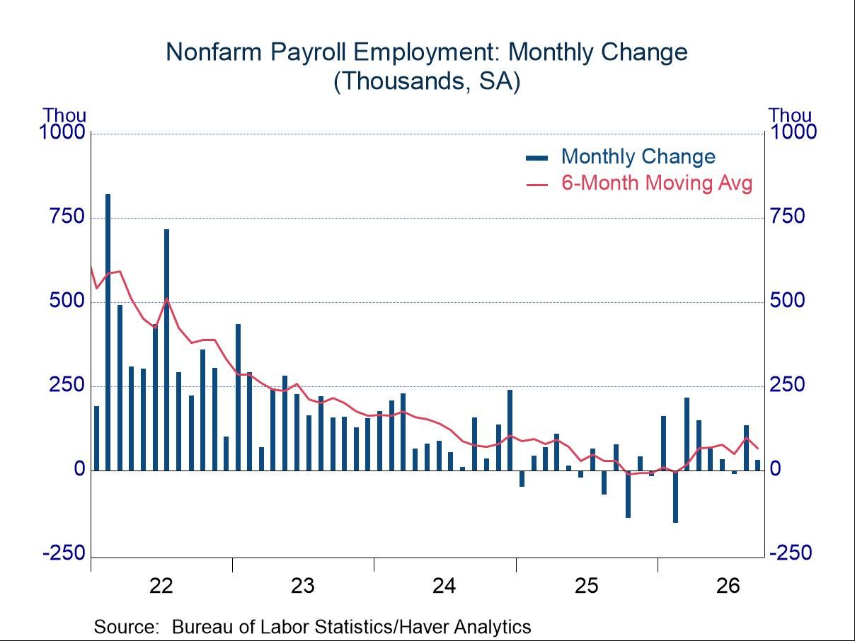
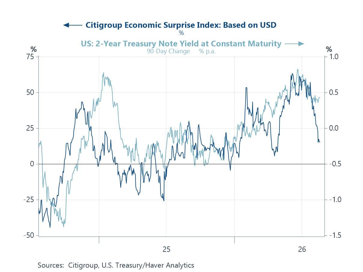
US Data Soften, and the Short End Takes Note One of the week’s most noteworthy developments has been the loss of momentum in the US data. Citigroup’s economic surprise index for the United States, shown in the chart below, has rolled over in recent weeks as activity releases — a disappointing employment report chief among them — have fallen short of expectations. The two-year Treasury yield, which reflects the market’s read on the Federal Reserve’s likely path, has moved a little lower in sympathy, as investors trim the odds of the further tightening that a hawkish July meeting had briefly put on the table. The message is that the short end of the curve remains, as it should, data-dependent and cyclical. What makes the present moment unusual is the contrast with the long end which, as some of the charts that follow help to explain, has been moving firmly in the opposite direction.
Chart 1: US Economic Surprises and the 2-Year Treasury Yield — The Short End Softens
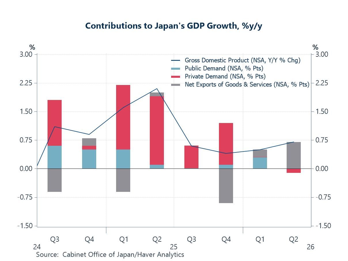
Japan’s Weak Domestic Demand Ties the BoJ’s Hands Japan sits awkwardly in the current conjuncture. The yen has fallen to levels last seen decades ago, and the pressure on the authorities to intervene, and on the Bank of Japan to tighten in the currency’s defence, has been building. Yet the latest national accounts, decomposed in the chart below, show why the Bank of Japan may hesitate. Growth has slowed through the first half of the year, and the composition is unflattering: private demand has been soft, and such growth as there has been has leaned heavily on net exports rather than on domestic strength. A central bank confronting a weak domestic economy is poorly placed to raise rates aggressively merely to support its currency, and that is precisely the bind in which the Bank of Japan now finds itself.
Chart 2: Contributions to Japan’s GDP Growth — Leaning on Trade, Not Demand
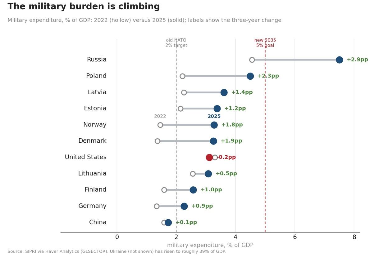
Rearmament Adds a New Claim on the Public Purse Among the structural forces now bearing on long-term rates, few are as visible as the marked increase in defence spending. The chart below sets military expenditure as a share of GDP in 2025 against its level three years earlier, and the increases are both broad and steep — most dramatic among the front-line states of Europe, where Poland, the Baltics and the Nordics have raised their burdens by two to three points of GDP in the space of three years. This is a large and, for the most part, non-negotiable claim on public resources, arriving when budgets are already stretched. Financed as it largely must be by borrowing, it adds directly to the supply of government debt that the world’s saving must absorb — and so to the upward pressure on the rates at which that debt is issued. For more discussion about this check out the analysis from Peter D’Antonio and Shashwat Indeevar in Efforts to Mitigate Military Risk Have Unintended Consequences.
Chart 3: Military Expenditure, % of GDP — 2022 versus 2025
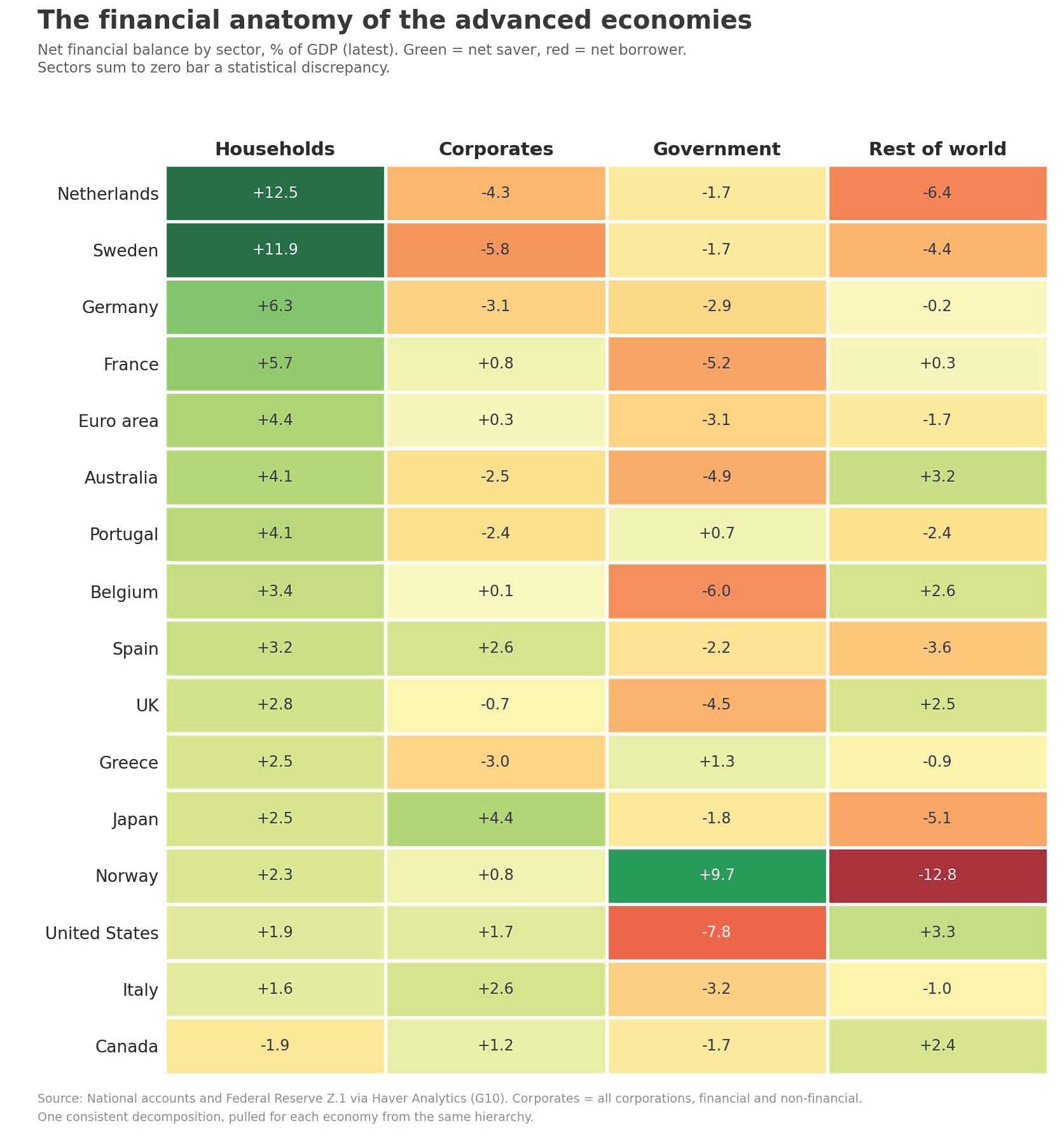
Where the Strain Falls: The Sectoral Balances To see where these pressures come to rest, it helps to view the economy through the flow-of-funds accounts, in which the financial balances of the four sectors — households, companies, government and the rest of the world — must sum to zero. The chart below sets out that anatomy for the advanced economies. Households remain in surplus almost everywhere, and governments are in deficit across the board — the United States most strikingly. But the column that matters most is the corporate one. For two decades the corporate sector was a dependable net saver, quietly supplying the rest of the economy with funds; that is no longer uniformly so. Several of the majors — Germany, the Netherlands and Sweden among them — now show corporates in deficit, as firms begin to invest more than they earn. The significance is that the corporate sector is turning from a supplier of the world's saving into a competitor for it, just as governments remain the borrowers of first resort. With two of the four sectors now drawing on the same finite pool at once, the price of that saving — the real long-term interest rate — has every reason to rise.
Chart 4: The Financial Anatomy of the Advanced Economies — Net Financial Balance by Sector, % of GDP
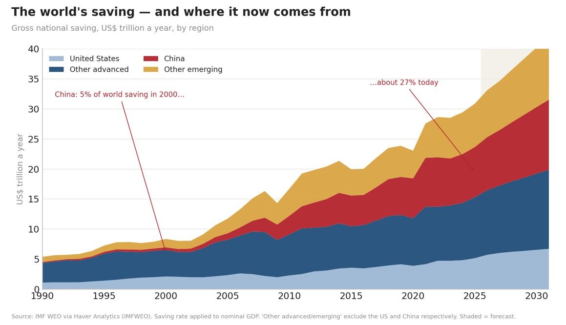
And Where the Saving Is: The Glut, Now Chinese If governments are competing for the world’s saving, it is worth asking where that saving actually resides. The chart below traces the pool of global saving over time and, more tellingly, its composition. Two decades ago Ben Bernanke described a global saving glut concentrated in emerging Asia and among the oil exporters; that glut has not dispersed but concentrated further, with China’s share rising from around a twentieth of the world total at the turn of the century to more than a quarter today. This is the reservoir on which deficit governments and a reviving investment cycle must both draw. Whether it continues to be recycled into Western debt as readily as before — a matter increasingly bound up with politics as much as economics — will do much to determine how far long-term rates ultimately climb.
Chart 5: The World’s Saving, US$ Trillion a Year, by Region — Concentrated in China
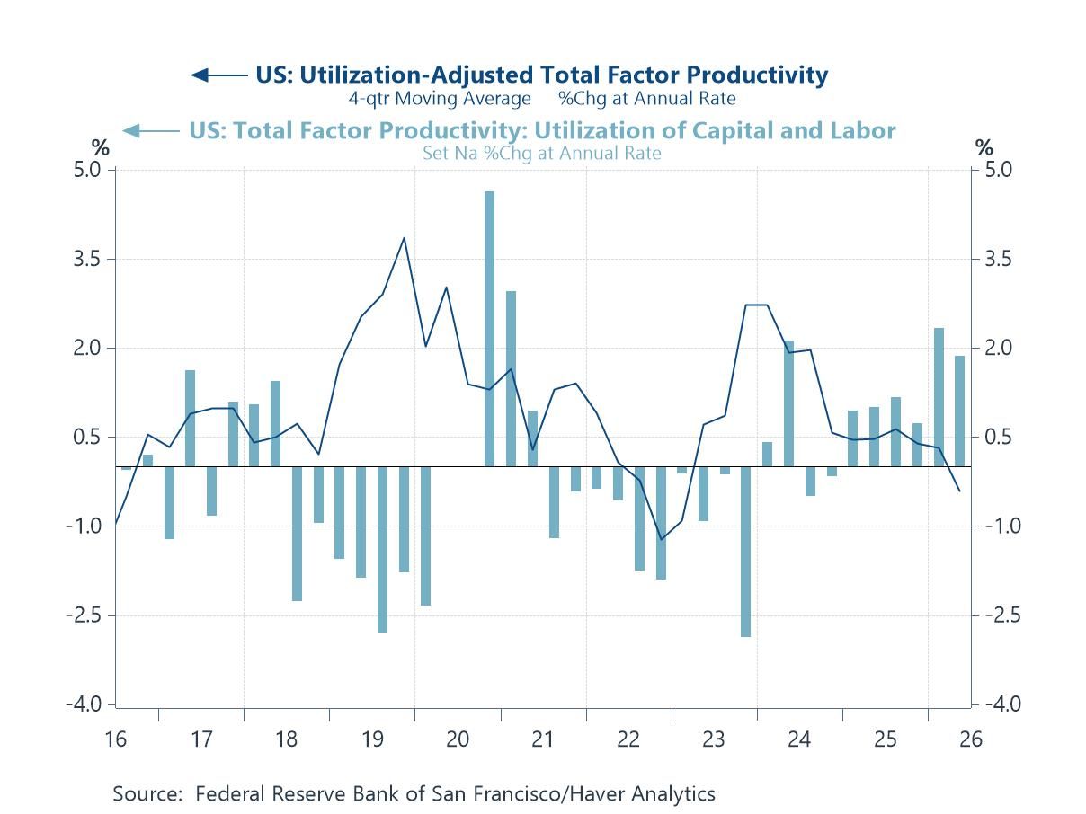
Will It Pay? The Productivity Question Our final chart brings the argument to its decisive question. A higher cost of capital is bearable if the investment it finances raises the economy's productive capacity, for then the growth arrives to service it. Total factor productivity — the part of output growth not explained by adding more capital or labour, and so the nearest thing economists have to a measure of pure efficiency — is where that payoff would show up. Raw productivity figures are hard to read over short horizons, however, because firms work their existing machines and employees harder when demand is strong and ease off when it is weak. The San Francisco Fed's series, shown in the chart below, separates the two effects: the pale bars capture that cyclical variation in the utilisation of capital and labour, while the darker line strips it out to leave utilisation-adjusted TFP — the cleaner read on genuine, underlying efficiency. It is the darker line that should give pause. Even as capital spending on artificial intelligence and its infrastructure has surged, underlying productivity growth has slipped into negative territory in the most recent quarters. It is early, and the gains from a technology of this kind may take years to appear in the aggregate data. But the figures are a reminder that the payoff on which the whole edifice rests is, for now, a matter of faith more than evidence — and that the cost of capital is rising regardless.
Chart 6: US Total Factor Productivity — The Payoff Has Yet to Show

Andrew Cates
AuthorMore in Author Profile »Andy Cates joined Haver Analytics as a Senior Economist in 2020. Andy has more than 25 years of experience forecasting the global economic outlook and in assessing the implications for policy settings and financial markets. He has held various senior positions in London in a number of Investment Banks including as Head of Developed Markets Economics at Nomura and as Chief Eurozone Economist at RBS. These followed a spell of 21 years as Senior International Economist at UBS, 5 of which were spent in Singapore. Prior to his time in financial services Andy was a UK economist at HM Treasury in London holding positions in the domestic forecasting and macroeconomic modelling units. He has a BA in Economics from the University of York and an MSc in Economics and Econometrics from the University of Southampton.
More Economy in Brief