Global| Jul 08 2025
Charts of the Week: Summer Resilience
by:Andrew Cates
|in:Economy in Brief
Summary
There will be no Charts of the Week publication for the next couple of weeks. The next edition will be released on Thursday, July 30th.
Recent buoyancy in global equity markets reflects a welcome mix of encouraging signals: growth is holding up better than many feared, inflation surprises have turned more benign, and most major central banks are poised to continue lowering interest rates in the period immediately ahead (charts 1, 2 and 3). There are, however, pockets of strain beneath the surface. Trade growth in Asia has slowed, most visibly in exports to the US, as tariffs and lingering tensions weigh on key sectors (chart 4). At the same time, China’s rising capital outflows point to firms and investors hedging their bets by shifting more assets abroad (chart 5). These undercurrents hint at an uneven global picture where trade frictions and capital shifts could test the durability of the recent calm. On a more positive note, the strong, steady climb in renewable energy production is a bright spot, underscoring the scale of investment pouring into the clean energy transition—even as real energy costs remain firm (chart 6). Altogether, while the broader backdrop remains supportive, new trade barriers, shifting capital flows, and the hidden costs of the green transition are watchpoints that could unsettle markets if growth momentum stalls or policy missteps occur.
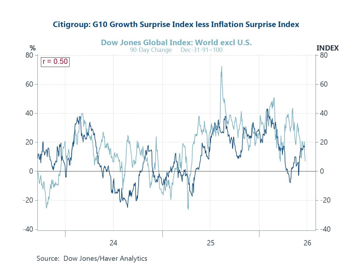
Equity markets and growth surprises Our first chart helps explain why global equity markets have remained buoyant in recent weeks despite some softer economic signals out of the US. The Citigroup surprise indices show that, on balance, global growth data have continued to surprise on the upside, while inflation readings have generally come in lower than expected. This combination—resilient global growth alongside moderating price pressures—has been supportive for risk assets. Investors appear to be drawing confidence from the prospect of a “soft landing” global backdrop: enough growth to support earnings but with cooling inflation that keeps central banks on track to ease policy further.
Chart 1: Global equity markets versus Global growth and inflation surprises

Global growth This next chart underscores, through the respective June readings for global composite PMIs, how global growth has arguably held up better than expected in recent weeks, helping to sustain positive risk sentiment. India continues to lead with a strikingly strong reading for June, signalling robust economic expansion, while the US also remains firmly in growth territory. Notably, the UK and Japan both posted healthier readings above 50, pointing to steady, broad-based momentum. China’s reading is also comfortably above 50, suggesting some resilience despite lingering concerns. Meanwhile, the euro area is hovering just above the neutral 50 mark, indicating modest growth, while South Africa and Brazil continue to lag behind, with Brazil slipping just below the expansion threshold.
Chart 2: Latest composite PMI readings for selected economies

Global supply chain pressures This next chart highlights one reason why global growth has so far proven more resilient than many expected: there is little sign at the global level of renewed supply chain stress despite recent shifts in US trade policy. The Federal Reserve Bank of New York’s global supply chain pressure Index remains broadly stable and well below the extreme levels seen during the pandemic, suggesting that supply bottlenecks are not (yet) driving significant upward pressure on global prices. This relative calm in global logistics implies that, for now, new or higher US tariffs have not materially disrupted global supply chains in the way some had feared, helping to support steady production flows and contain cost pressures—key ingredients behind the more stable global growth picture seen in recent months
Chart 3: Global supply chain pressures index versus global inflation surprises

Asia’s trade with the US All that aside, Asia’s exports to the US have already begun to weaken—despite the ongoing tariff pause—and now face broader risks as new post-pause tariff rates are announced.US President Trump’s sector-specific tariffs are weighing on exports from key trading partners, particularly in Asia. For example, auto-export-heavy economies such as Japan and South Korea have seen their rolling 12-month exports to the US stagnate this year, as Trump’s 25% auto tariffs have taken a toll. In response, some producers have been forced to cut prices to absorb part of the tariff burden, squeezing their profit margins. More broadly, China’s exports to the US have plummeted this year amid escalating trade tensions. Although both countries recently agreed to roll back many previous tariff escalations, the agreement has not fully alleviated the uncertainty surrounding the bilateral trade environment—especially given that the rollback is only temporary.
Chart 4: Asia’s exports to the US

China’s capital flows China has also experienced a sustained trend of rising capital outflows in recent years, as illustrated in the chart below. This trend has continued into 2025, with rolling four-quarter total capital outflows exceeding half a trillion US dollars in the first quarter. The surge reflects a mix of investor motivations, including a growing desire to diversify assets abroad. A significant portion of these recent outflows has come from the acquisition of foreign portfolio investment assets, indicating an outward shift of capital into international financial markets. These outflows have contributed to downward pressure on the yuan, which has depreciated notably this year. However, the impact has been partially offset by concurrent weakness in the US dollar, amid recently subdued—yet still unresolved—US-China trade tensions. Despite ongoing currency pressures, Chinese authorities have moved to increase the foreign exchange quota for Qualified Domestic Institutional Investors (QDII), allowing greater investment in overseas securities, as depreciation pressure on the yuan has eased somewhat in recent months.
Chart 5: Capital outflows from China

Renewable energy production On a more positive note, this final chart shows the remarkable growth trajectory of global renewable energy production over the past two decades, which has accelerated sharply in recent years. Total renewable generation has climbed steadily to exceed 5,000 terawatt-hours, with China emerging as the dominant driver of this expansion. Europe and North America have also contributed significantly, while the rest of the world is adding to the momentum as emerging markets ramp up investment in cleaner power sources. This sustained surge reflects rising global commitments to decarbonisation and the transition away from fossil fuels, underpinned by technological advances and policy support. However, it’s important to note that despite this impressive growth in renewable supply, real energy costs for many consumers have continued to rise over the same period—highlighting the challenges of integrating renewables at scale, upgrading grids, and balancing supply with demand during the transition.
Chart 6: Renewable energy production by major region


Andrew Cates
AuthorMore in Author Profile »Andy Cates joined Haver Analytics as a Senior Economist in 2020. Andy has more than 25 years of experience forecasting the global economic outlook and in assessing the implications for policy settings and financial markets. He has held various senior positions in London in a number of Investment Banks including as Head of Developed Markets Economics at Nomura and as Chief Eurozone Economist at RBS. These followed a spell of 21 years as Senior International Economist at UBS, 5 of which were spent in Singapore. Prior to his time in financial services Andy was a UK economist at HM Treasury in London holding positions in the domestic forecasting and macroeconomic modelling units. He has a BA in Economics from the University of York and an MSc in Economics and Econometrics from the University of Southampton.
More Economy in Brief