 Global
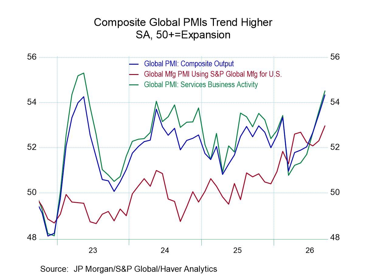
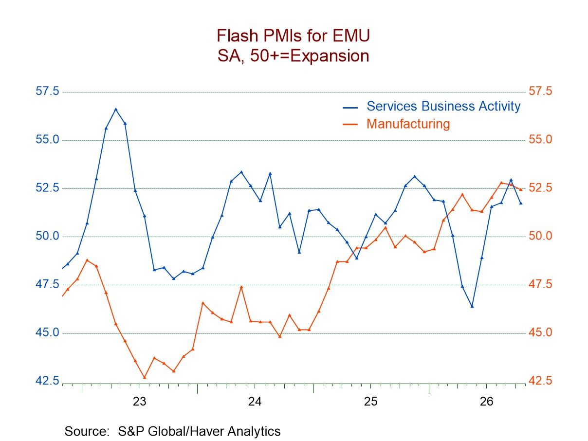
Among the early reporting countries, I present flash readings for the S&P PMIs in October. Only two of these reporters, the United Kingdom and India, show stronger headline PMI readings in October than they had in September. For reporters Germany, the U.K., Australia, and the United States, stronger PMI readings for the manufacturing sector emerge in October compared to September. However, only the U.K. and Japan report stronger services readings in October than they reported in September.
The weakness in services is very broad-based, while the weakness in manufacturing is mixed. The impact on the headline causes readings to be weaker in most cases in October than they were in September. This rounds out the picture of an uneven economy as central banks are on the path to fight what has been an excess of inflation, as energy prices continue at uncomfortably high levels.
However, these results are only for the month of October. If we look at the three-month averages, which are based on historical final data and so do not include the October ‘flash’ readings, we have stronger readings across the board for the headline PMI. We have stronger readings across the board except for India in services. Also, over three months, the performance of the manufacturing sector is mixed, with four stronger and four weaker reporters.
For six months the picture is more uneven, as slightly more readings are weakening compared to the 12-month readings that are strengthening. However, over six months the U.S. shows strengthening on all three sector readings, as does India. Three-sector weakness over six months comes from Australia, while Japan, the U.K., France, Germany, and the European Monetary Union all show the headline weaker over six months, driven by a weaker services sector.
Over 12 months all the readings are stronger for all three sectors for all country comparisons except the U.S. For the U.S., weaker readings are in the services sector and the composite index compared to a year ago.
The queue percentile standings paint an upbeat picture, with the average composite reading at a 52nd percentile standing, above its historic median; manufacturing at a 58th percentile standing is looking quite strong, while services at a 46.8 percentile standing shows that the services sector has performed below its median performance on data back to 2021. Australia and India are the weakest on these timelines in terms of their ranking for their composites as well as because they have below-median results for their manufacturing and services sectors. The U.S. shows the strongest statistics on this comparison, with an 86.8 percentile standing for its composite, a 77.9 percentile standing for manufacturing, and an 85.3 percentile standing for services. Among the remaining countries, only France has a composite reading below its median, meaning it is below a ranking of 50%, while Japan manages a headline ranking of 72.1% despite having a services ranking below its 50% mark, and it does that on the strength of a manufacturing ranking in its 80.9 percentile.
Changes over 12 months show declines in all three PMI sector readings only in India and in Australia. The U.K. and France show improvements in all three sectors over 12 months, while the monetary union and Germany show headline declines over 12 months caused by a weakening services sector in the face of solid increases in manufacturing.