Global| Jun 18 2026
Charts of the Week: Between Relief and Reality
by:Andrew Cates
|in:Economy in Brief
Summary
The signing of a Memorandum of Understanding (MoU) between the United States and Iran earlier this week has offered financial markets their most significant moment of geopolitical relief since the Middle East conflict escalated in early March. Oil prices fell sharply on the news, short-dated bond yields moved lower across several major economies, and risk assets recovered ground. But relief, as investors have learnt repeatedly over the past three months, is arguably not the same as resolution. The MoU sets a framework for negotiations rather than a final settlement, and the history of US-Iran diplomacy is not one that encourages complacency. Meanwhile, the Federal Reserve — concluding its June meeting yesterday under new chair Kevin Warsh — held rates steady but delivered a distinctly hawkish dot plot that shifted the median year-end projection from a cut to a hike, a reminder that the easing cycle the market had been pricing is no longer the base case. Against this backdrop, this week's charts take stock of where the global economy presently stands — and what the underlying data, beneath the geopolitical noise, are telling us. The picture that emerges is one of divergence. The United States continues to outperform consensus growth expectations while Europe and China disappoint (chart 1). UK short-dated yields have tracked oil prices with unusual consistency this year, and today's softer-than-expected CPI print for May — arriving just as the MoU has knocked crude lower — potentially changes the policy calculus for the Bank of England (chart 2). Global semiconductor sales, meanwhile, are storming ahead regardless of the geopolitical noise, powered by AI infrastructure spending that shows no sign of fatigue (chart 3). A cross-section of commodity prices tells two stories simultaneously: the geopolitical risk premium is draining out of oil, but the metals and materials the AI economy actually needs — copper, uranium, critical minerals — are holding firm (chart 4). Meanwhile a cross-country scatter of electricity generation and GDP growth over the past five years raises a question that deserves more attention than it typically gets: is energy availability a constraint on growth, or merely a consequence of it? The evidence, we would argue, points firmly in one direction (chart 5). And finally, for all the comparisons being drawn between the current investment boom and the late 1990s, the financial balance of the US corporate sector tells a rather different story — one that matters for how any correction might unfold (chart 6).
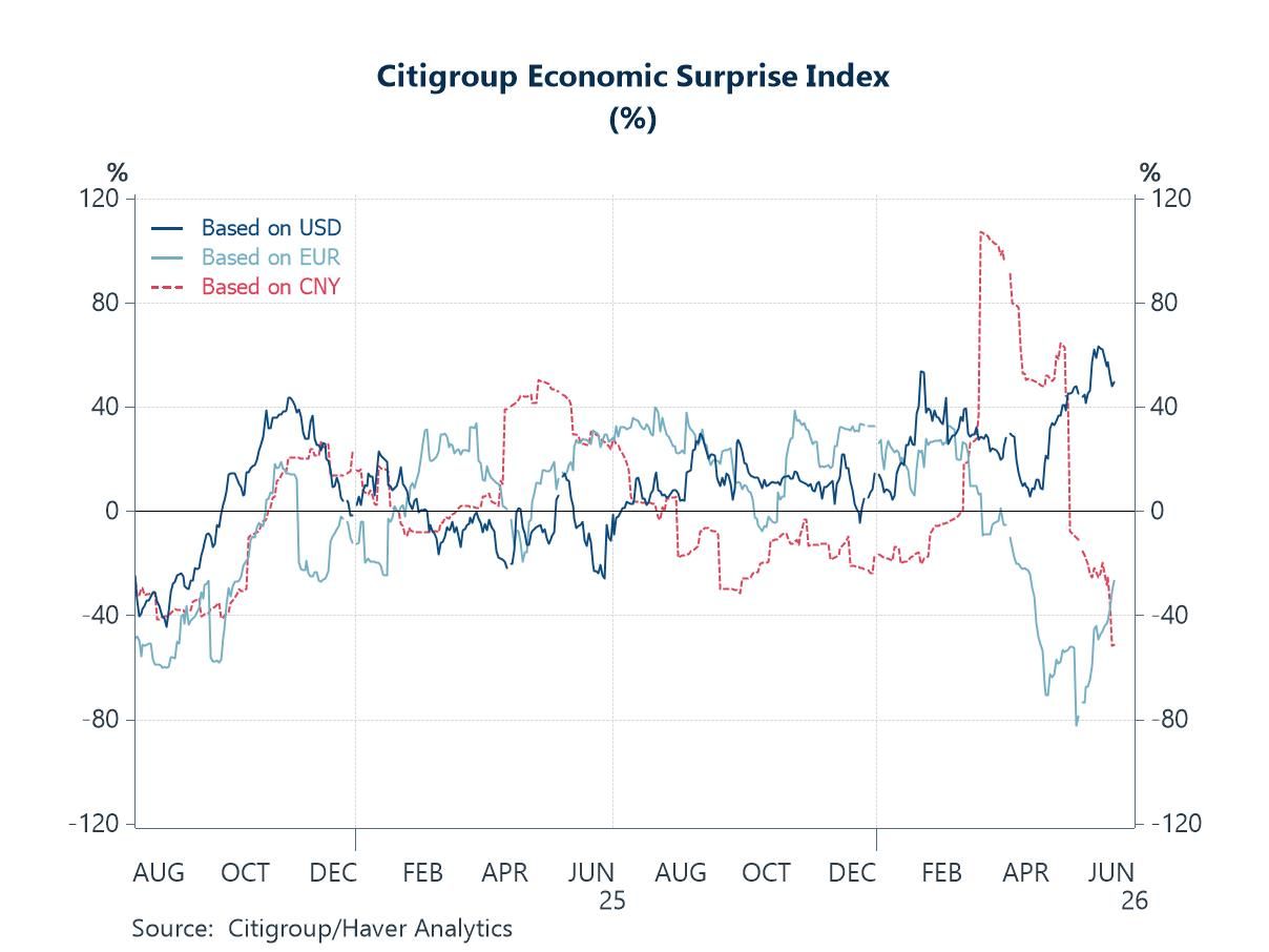
US Outperformance Holds; Europe and China Continue to Disappoint One of the most persistent features of the global macro landscape in 2026 has been the widening divergence between growth outcomes in the United States and those in Europe and China. Citigroup’s global growth surprise indices—which measure the gap between actual economic releases and consensus expectations—capture this divergence with unusual clarity. US data have continued to surprise on the upside, supported by resilient consumer spending, a stronger-than-expected labour market and the ongoing AI-driven capital spending boom. The picture elsewhere is less encouraging. Growth surprises have turned negative across the euro area, reflecting the cumulative toll of elevated energy costs, weak industrial activity and subdued business confidence. And China's growth surprise index has also fallen sharply in recent weeks, with weaker-than-expected retail sales and fixed asset investment data for May this week reinforcing concerns that domestic demand remains fragile and that policy support is yet to gain meaningful traction.
Chart 1: Global Growth Surprises — The Widening Divide
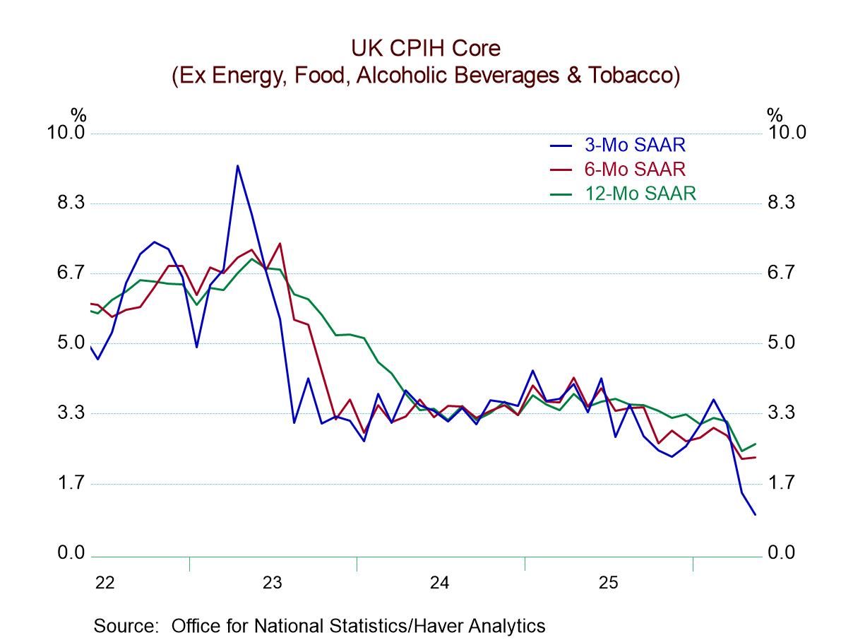
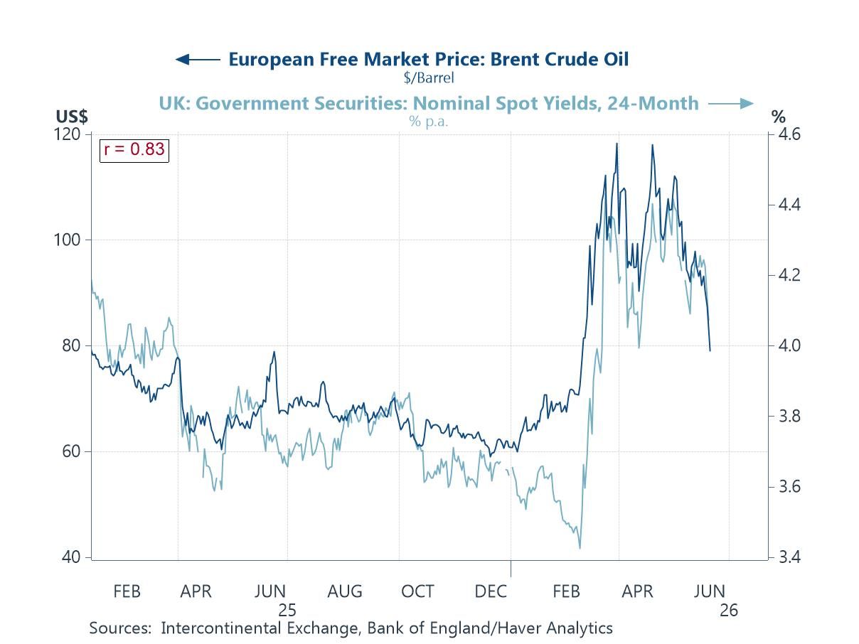
The Oil Risk Premium in the UK Has Been Fading One of the more notable features of UK markets this year has been the close relationship between oil prices and two-year gilt yields. The link is not mechanical, but in an economy heavily exposed to imported energy, swings in oil prices can materially alter the inflation outlook and, by extension, expectations for Bank of England policy. That relationship was on display again this week. A softer-than-expected UK CPI reading for May—helped in part by easing energy price pressures—led investors to scale back expectations that inflation would remain persistently above target, pushing two-year gilt yields to their lowest level in six weeks. The question now is whether this marks the start of a more sustained easing in inflation pressures or merely a temporary reprieve. Much will depend on whether the recent decline in oil prices following the US-Iran ceasefire agreement proves durable.
Chart 2: Oil Prices and UK 2-Year Gilt Yields — Joined at the Hip
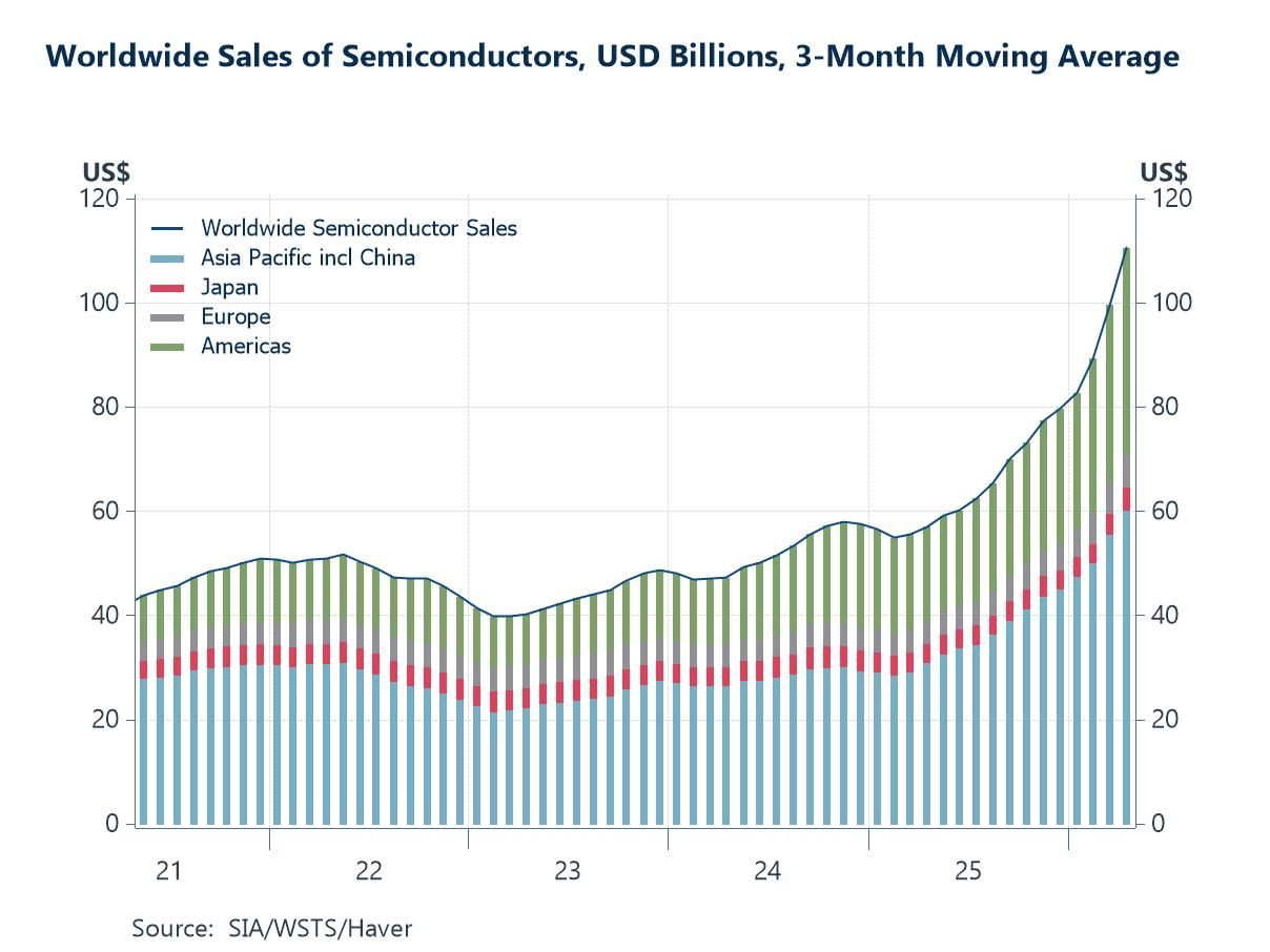
The AI Investment Boom Is Rewriting the Rule Book for the Chip Industry If the divergence in global growth surprises noted above tells a story of a world economy under strain, the semiconductor sales data tell a very different one — of a technology-driven investment cycle that is accelerating almost regardless of the broader macro environment. Global semiconductor sales have surged to record levels over the past twelve months, driven primarily by insatiable demand for the chips that underpin AI infrastructure: graphics processing units, high-bandwidth memory, and advanced logic chips. Data centre capital expenditure from the hyperscalers continues to exceed even the most optimistic forecasts from a year ago, and the investment pipeline shows no sign of moderating. The gains are concentrated in AI-adjacent products; legacy chips for consumer electronics and industrial applications remain relatively soft.
Chart 3: Worldwide Semiconductor Sales — The Cycle Accelerates
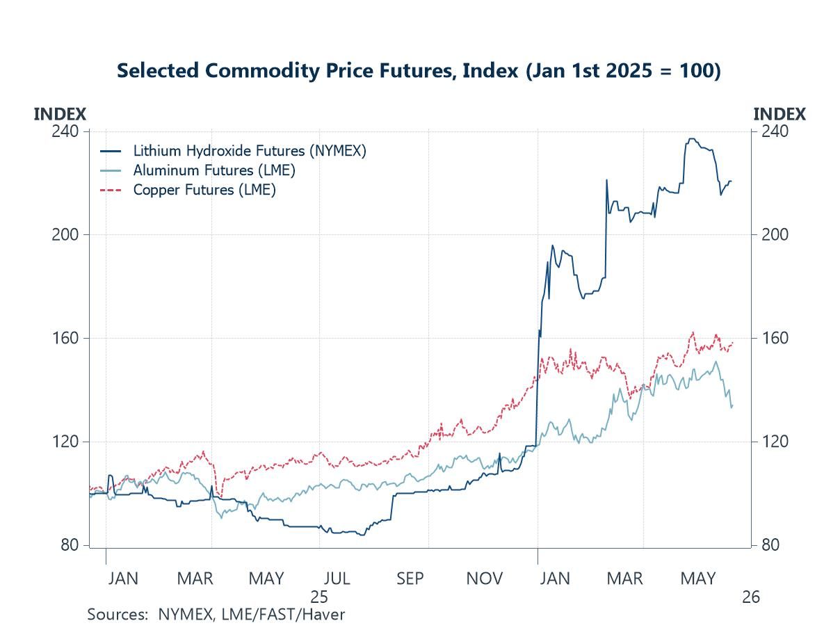
Copper Holds Firm As Oil Retreats The commodity markets are telling two quite different stories this week, and the contrast is instructive. Oil has moved sharply lower on the US-Iran MoU news as investors trim the conflict risk premium that has been embedded in energy markets since March — a welcome development for inflation and central bank optionality alike. But the three commodities shown in this chart tell a different story. Copper, one of the most reliable proxies for global electricity infrastructure investment, remains near multi-year highs, reflecting the extraordinary volume of data centre construction, grid expansion and electrification spending flowing through the global economy. Aluminium — energy-intensive to produce and increasingly in demand for the structural components of both data centres and electric vehicles — has, until quite recently, held its ground. Lithium hydroxide, the battery-grade refining product that sits at the heart of the energy storage supply chain, has seen some cyclical softness but remains structurally underpinned by the scale of demand being projected for grid-scale storage and electric mobility over the next decade.
Chart 4: Selected Commodity Prices — The AI Basket vs the Geopolitical Basket
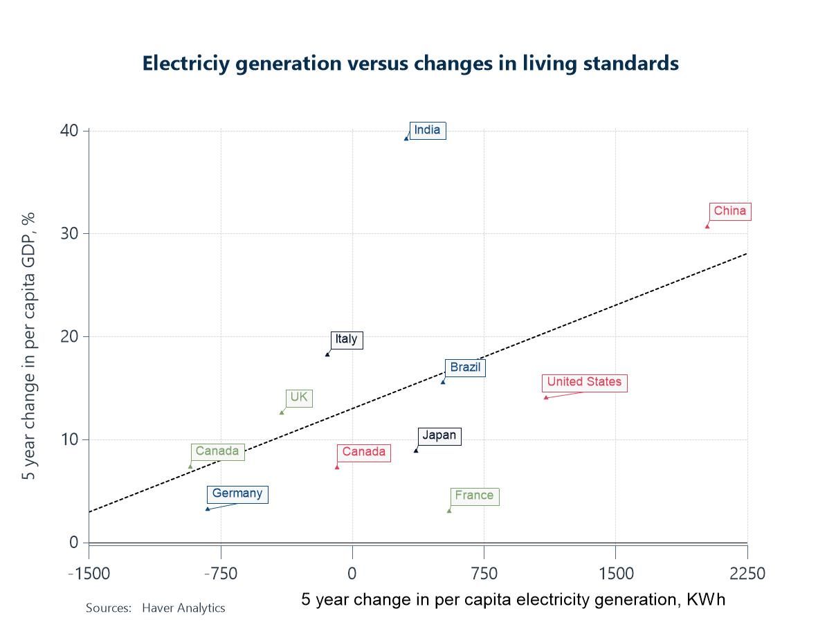
Is Energy Availability a Binding Constraint on Growth? This next chart is a scatter plot that maps electricity generation per capita against GDP growth per capita across a broad sample of countries over the past five years. The positive relationship is striking. Economies with higher electricity generation per capita, including the United States, have generally delivered stronger GDP growth, while those with more constrained electricity systems have tended to lag. The obvious objection is reverse causality: richer economies generate more electricity because they have more to power. That is partly true. But the broader evidence is difficult to dismiss. The US shale revolution delivered an abundance of cheap energy that supported a sustained period of industrial outperformance relative to many advanced economies. Mainstream commentary often attributed this advantage to factors such as labour market flexibility or technological innovation, but energy costs were arguably at least as important.
Chart 5: Electricity Generation per Capita vs GDP Growth per Capita — Which Is Wagging Which?
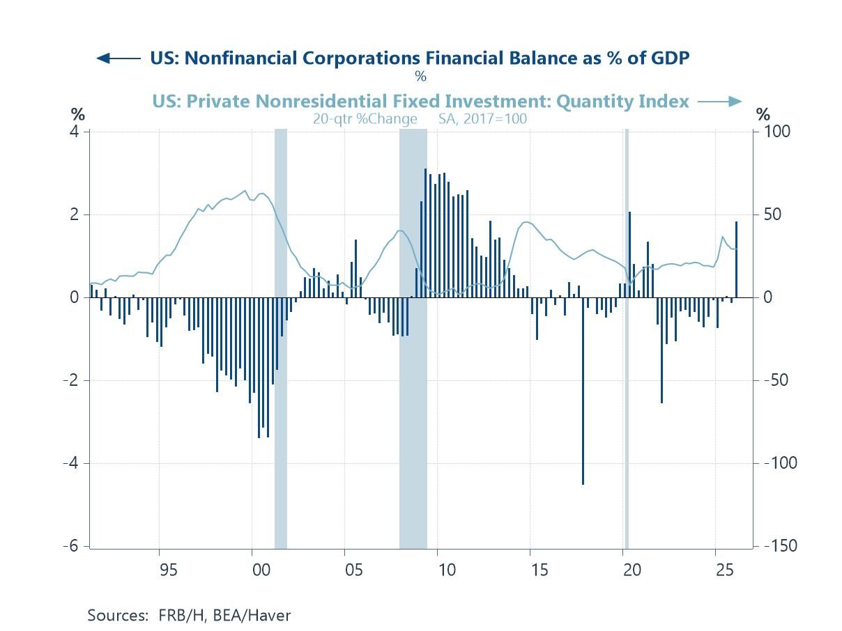
Corporate America Is Investing from a Position of Unusual Financial Strength The surge in US corporate investment—particularly in AI infrastructure, data centres and semiconductors—has inevitably drawn comparisons with the late-1990s dot-com boom. Yet the financial balance data suggest an important difference. During the dot-com era, US non-financial corporates moved into a financial deficit approaching 4% of GDP, relying heavily on external financing to fund investment. Today, despite another ambitious investment cycle, the sector remains in surplus, currently around 1.8% of GDP. Corporate America is investing aggressively, but it is still generating more cash than it is spending. The boom is being financed largely through profits rather than debt. Risks remain—not least the growing fiscal burden on the federal government—but the balance-sheet fragilities that turned previous investment booms into systemic crises appear far less pronounced. If a major constraint emerges in the years ahead, it may be energy and resources rather than leverage.
Chart 6: US Corporate Sector Financial Balance — This Boom Is Different

Andrew Cates
AuthorMore in Author Profile »Andy Cates joined Haver Analytics as a Senior Economist in 2020. Andy has more than 25 years of experience forecasting the global economic outlook and in assessing the implications for policy settings and financial markets. He has held various senior positions in London in a number of Investment Banks including as Head of Developed Markets Economics at Nomura and as Chief Eurozone Economist at RBS. These followed a spell of 21 years as Senior International Economist at UBS, 5 of which were spent in Singapore. Prior to his time in financial services Andy was a UK economist at HM Treasury in London holding positions in the domestic forecasting and macroeconomic modelling units. He has a BA in Economics from the University of York and an MSc in Economics and Econometrics from the University of Southampton.
More Economy in Brief