Global| Mar 16 2007
U.S. Industrial Production Increased 1.0 percent in February
Summary
There are 86,400 seconds in a day: 24 hours x 60 minutes x 60 seconds. In February, according to the Oil Market Intelligence publication of industry consulting firm Energy Intelligence, the world consumed 87,069 million barrels of [...]
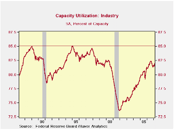 Industrial data have given off very mixed signals. Part of it is that autos are weaker than the sector at large. But also regional manufacturing surveys have really disconnected from the National ISM and from actual Industrial production results. The look-ahead to March manufacturing surveys from the Philly Fed and NY Fed were both quite weak. Philly also was weak for February but New York’s Empire State index jumped for that one month then fell back. So having a nice firm rise in industrial production for February in the main actual reading on industrial output is somewhat reassuring.The IP report shows a 3-month trend UP at a 3.9% pace; for the quarter to date (final column in red) a rise at a 1.7% rate. Consumer goods output is expanding at a 5.3% pace in Q1. Business equipment is contracting in the quarter to date at a pace of 0.9%. But for materials, the greater part of IP, the pace of output is rising at a pace of 2.7%. For the first quarter industrial output is rising, but struggling; its down by 0.3% over 6-months for manufacturing alone. For consumer durables autos weakness is severe at a drop of 3.5%; ex autos durables consumer output is up at a 1.3% pace. Nondurable consumer goods output is strong, up by 7.4% at an annual rate; if it weren’t for the strength in consumer energy, the gain would be at a pace of 2.1%. On balance the figures are relatively firm compared especially to recent manufacturing surveys on the sector. Industrial data have given off very mixed signals. Part of it is that autos are weaker than the sector at large. But also regional manufacturing surveys have really disconnected from the National ISM and from actual Industrial production results. The look-ahead to March manufacturing surveys from the Philly Fed and NY Fed were both quite weak. Philly also was weak for February but New York’s Empire State index jumped for that one month then fell back. So having a nice firm rise in industrial production for February in the main actual reading on industrial output is somewhat reassuring.The IP report shows a 3-month trend UP at a 3.9% pace; for the quarter to date (final column in red) a rise at a 1.7% rate. Consumer goods output is expanding at a 5.3% pace in Q1. Business equipment is contracting in the quarter to date at a pace of 0.9%. But for materials, the greater part of IP, the pace of output is rising at a pace of 2.7%. For the first quarter industrial output is rising, but struggling; its down by 0.3% over 6-months for manufacturing alone. For consumer durables autos weakness is severe at a drop of 3.5%; ex autos durables consumer output is up at a 1.3% pace. Nondurable consumer goods output is strong, up by 7.4% at an annual rate; if it weren’t for the strength in consumer energy, the gain would be at a pace of 2.1%. On balance the figures are relatively firm compared especially to recent manufacturing surveys on the sector.Capacity utilization continues to hold to strong levels but is at the same time well short of the past cycle peak. Capacity is not an issue in manufacturing. It has been on a plateau in recent months. On balance industrial output is still showing gains. The first quarter of 2007 appears as though it will be a quarter of growth. Manufacturing surveys so far in the quarter seem to paint a weaker picture than the actual inflation-adjusted report on output itself. While that is a bit disconcerting, it is better that way, than the other way around. |
| Monthly Pct. Changes | At Annual Rates of Change | SAAR | |||||
| Month-to-month Pct. Change | 3-Month | 6-Month | Year/Year | 07-Q1 | |||
| Industrial Output | Feb-07 | Jan-07 | Dec-06 | %Change | %Change | %Change | Pct Change |
| All Prod&Materials | 0.9% | -0.3% | 0.8% | 5.7% | 1.1% | 3.4% | 2.7% |
| All Products | 0.9% | -0.4% | 0.8% | 5.4% | 1.6% | 3.6% | 2.9% |
| Final Products | 1.1% | -0.4% | 0.8% | 6.0% | 2.8% | 4.6% | 3.8% |
| Manufacturing only | |||||||
| MFG - NAICS | 0.3% | -0.5% | 1.1% | 3.9% | -0.3% | 2.9% | 1.7% |
| MFG-Durables | 0.7% | -0.8% | 1.2% | 4.3% | 0.0% | 4.3% | 1.7% |
| MFG-Nondurables | -0.1% | -0.2% | 1.1% | 3.4% | -0.7% | 1.1% | 1.7% |
| Consumer Goods | 1.5% | 0.0% | 0.4% | 7.4% | 3.3% | 3.4% | 5.3% |
| Durables | 1.6% | -2.6% | 1.7% | 2.7% | -2.1% | -1.0% | -1.0% |
| Automotive Production | 3.2% | -5.1% | 2.4% | 1.6% | -2.0% | -2.3% | -3.5% |
| Ex. Automotive Production | 0.2% | -0.3% | 1.1% | 3.7% | -2.1% | 0.1% | 1.3% |
| Nondurables | 1.5% | 0.8% | 0.0% | 9.2% | 5.2% | 4.9% | 7.4% |
| Non Energy | 0.3% | -0.3% | 0.8% | 3.3% | 3.7% | 3.5% | 2.1% |
| Cons Energy | 5.3% | 4.4% | -2.5% | 28.6% | 10.4% | 9.5% | 26.0% |
| Business Equip. | 0.4% | -2.1% | 2.2% | 1.9% | 2.3% | 8.5% | -0.9% |
| Transportation | -0.1% | -1.7% | 1.6% | -0.8% | 6.4% | 9.2% | 2.1% |
| Computer&Office Eqpt | 5.1% | 2.8% | 1.8% | 40.1% | 34.4% | 30.8% | 39.6% |
| Ex. Tech.& Transport | 0.0% | -2.3% | 2.4% | 0.3% | 0.3% | 7.5% | -2.6% |
| Materials | 1.0% | -0.2% | 0.8% | 6.5% | 0.4% | 3.2% | 2.7% |
| Durables | 0.9% | 0.5% | 0.8% | 8.7% | 0.8% | 4.9% | 5.6% |
| Nondurables - Excl Energy | 0.4% | -1.4% | 1.4% | 1.2% | -3.2% | -0.3% | -2.9% |
| Energy | 1.9% | -0.2% | 0.2% | 7.6% | 3.2% | 3.9% | 3.1% |
| Actual Auto Production Levels | |||||||
| Month-to-month Pct. Change | 3-Month | 6-Month | Year/Year | 04-Q1 | |||
| Vehicle Production | Feb-07 | Jan-07 | Dec-06 | %Change | %Change | %Change | Pct Change |
| Autos | -4.0% | 15.8% | -11.4% | -6.3% | -36.4% | -10.9% | -9.8% |
| Trucks | 11.8% | 8.0% | -11.0% | 30.0% | -12.8% | 1.8% | 13.0% |
 The Report in Brief. Food prices surged +0.8%) and energy jumped +0.9%, but the core held at a 0.2% gain. Still the Yr/Yr core at 2.7% remains lofty and a 2.6% the three month trend is not much better; Year-to-date core inflation is up by 3%. - So much for showing signs of progress. Recreation costs came down to flat this month but that series has been subdued. Transportation was up by just 0.1%; that was mostly weak vehicle prices. Housing costs pushed higher by 0.4% in the month as owner equivalent rent rose by 0.3%. Apparel was up by 0.5%. Medical care ‘slipped’ to +0.5% after rising by 0.8% in January. Core goods prices rose by 0.1%. Core services prices rose by 0.3% Core goods prices are flat year-over-year. Core services prices are up at a 3.8% Pace Yr/yr. Upshot? International competition is doing little to tame the inflation pressure in the services sector.There is Something About Inflation. Let’s begin by defining the familiar to better understand it. Inflation is a persisting rise in the price level. That explains everyday life in the modern economy. We live with inflation. The real question is, ‘when is inflation ‘excessive?’
| Total: 56 categories | Detailed Diffusion By Various Horizons: | |||||||
| Total CPI | One Mo. | 3-Mos. | 6-Mos. | 1-Yr. | ||||
| CPI SAAR | 4.5% | 4.0% | 0.0% | 2.4% | ||||
| % Accelerating | 0.57 | 0.70 | 0.54 | 0.53 | ||||
| % Unchanged | 0.00 | 0.00 | 0.00 | 0.00 | ||||
| % Decelerating | 0.43 | 0.30 | 0.46 | 0.47 | ||||
| Total Diffusion Gauge | 0.57 | 0.70 | 0.54 | 0.53 | ||||
| Core: 35 Categories | Diffusion trends are low: (values below .50 are good) | |||||||
| Core CPI | One Mo. | 3-Mos. | 6-Mos. | 1-Yr. | ||||
| Core CPI SAAR | 2.9% | 2.6% | 2.2% | 2.7% | ||||
| % Accelerating | 0.57 | 0.60 | 0.40 | 0.57 | ||||
| % Unchanged | 0.00 | 0.00 | 0.00 | 0.00 | ||||
| % Decelerating | 0.43 | 0.40 | 0.60 | 0.43 | ||||
| Core Diffusion Gauge | 0.57 | 0.60 | 0.40 | 0.57 | ||||
| Diffusion: 1-mo is vs 1-mo ago; 3-Mo is vs 3-Mo; ago 6-Mo is vs 6-Mo; ago 12-Mo is vs 12-Mo ago | ||||||||
| Detailed diffusion measures over various horizons | ||||||||
| What we find this month IS DISTURBING on those growths, First of call core inflation is disturbingly rising from 2.2% over six months to 2.5% over three months to 2.9% (Feb SAAR). The Yr/Yr pace is 2.7%. Moreover, the CORE diffusion readings are 40 for 6-mos, 60 for 3mos and 57 for one month. A value over 50 shows inflation is accelerating in more categories than it decelerating. For Yr/YR core CPI diffusion is 57. That means that we find inflation’s trend is accelerating at the core level AND we find that most components within the Core CPI are showing the same tendency toward acceleration that we see in the headline. Sure the move up is mild. The pace itself is mild but the pace is OVER THE FED’S OWN SELF-IMPOSED SPEED LIMIT, or guideline we should day.Speeding? Central Banker: Ticket thyself!So does the Fed obey its own rules on inflation? Not really - sort of. This is policy in the making and like sausage the result is better enjoyed than the process discussed...nonetheless:The Process As you know the Fed has a dual mandate for sustaining growth and containing inflation. Plus, as we assess the Fed, any sort of judgment may span more than one Fed leader - whose ways do change. Still the 2% inflation threshold is like the Holy Grail for central bankers. The Bank of England uses it and the ECB uses 2% as its ceiling. The Fed uses it as the top of its comfort zone (for the PCE) but sort of transforms it to 2.4% for the CPI due to ‘distortions’ (don’t ask, don’t tell – at least not now). |
|---|
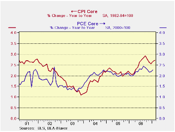
| Under Greenspan the Fed surely did cut interest rates with the CPI Core well over this top rate for inflation ( see chart above). Of course, at the time the economy and industrial production were declining rapidly. Although the Fed was uncomfortable doing so, when the core CPI fell below 1.4% the Fed cut interest rates further. But when the pace of the core CPI got back to 2% the Fed began raising rates (all this was Greenspan). With the CPI core between 2% and 2.4% the Fed continued to hike rates. Bernanke took over at the Fed and continued this process then stopped with the Funds rate at 5.25% in July of 2006. But inflation did not stop accelerating. It continued to accelerate then it decelerated mildly a few months later and now has a three observation uptrend in place once again and the Fed is still holding rates steady with inflation STILL, for eight straight months, over the top of its range.As you can see the Fed’s policy non-target is a simple thing. But making policy involves more than just this bare target framework. For now inflation’s momentum is going the wrong way and diffusion tells us that the acceleration is widespread and therefore likely to continue. With the economy still struggling the Fed has a difficult choice to make. Never get comfortable thinking that policy can be as simple as the Feds own expression of a simple policy comfort zone. |
|---|
| Overview: Excess remains moderation in question | ||||||||
| Quick Summary | Year-To-Date | One Mo. | Mo/Mo | |||||
| Yr/Yr | 6-Mo a.r | 3-Mo a.r | 2007 | 2006 | Diffusion | Feb.2007 | ||
| CPI | 2.4% | 0.1% | 4.0% | 3.3% | 4.0% | 57.1 | NOT | |
| Core CPI | 2.7% | 2.2% | 2.6% | 3.0% | 2.1% | 57.1 | Annualized | |
| Commodity Category | Mo. ar | Annualized Inflation Rate For Last: | ||||||
| By Expenditure Category | Feb.2007 | % Wgt | 3-Mos | 6-Mos. | Year | Month | ||
| All Items | 4.5% | 100.00 | 4.0% | 0.1% | 2.4% | 0.4% | ||
| Food and Beverages | 9.8% | 16.20 | 5.9% | 4.1% | 3.1% | 0.8% | ||
| Housing | 4.8% | 39.98 | 4.2% | 3.6% | 3.3% | 0.4% | ||
| Apparel & Upkeep | 6.4% | 4.45 | 4.1% | 1.9% | 2.1% | 0.5% | ||
| Transportation | 0.6% | 17.57 | 3.8% | -13.3% | -0.5% | 0.1% | ||
| Medical care | 5.9% | 5.81 | 6.0% | 4.6% | 4.3% | 0.5% | ||
| Recreation | -0.1% | 5.91 | -0.9% | 0.4% | 1.6% | -0.3% | ||
| Education & Communication | 4.1% | 5.31 | 1.5% | 5.9% | 5.1% | 0.7% | ||
| Other Goods & Services | 2.6% | 4.77 | 6.8% | 5.0% | 3.6% | 0.2% | ||
| By Industry Group | ||||||||
| Nondurables (NSA) | 3.2% | 31.26 | 4.7% | -3.8% | 1.9% | 0.3% | ||
| Durables | -1.3% | 10.57 | -2.8% | -3.4% | -1.8% | -0.1% | ||
| Services | 4.7% | 58.17 | 4.3% | 3.7% | 3.4% | 0.4% | ||
| By Economic Group | ||||||||
| All Excl Food & Energy | 2.9% | 77.10 | 2.6% | 2.2% | 2.7% | 0.2% | ||
| (Median Increase) | 4.2% | 100.00 | 4.1% | 3.6% | 2.3% | 0.3% | ||
| Excl. Energy | 4.0% | 92.32 | 3.1% | 2.4% | 2.8% | 0.3% | ||
| Commodities: Excl Food & Energy | 1.0% | 22.77 | 0.7% | (29% of core) | -0.9% | 0.0% | 0.1% | |
| Services: Excl Energy | 3.7% | 54.33 | 3.5% | (71% of core) | 3.5% | 3.8% | 0.3% | |
| Core less Tobacco | #N/A | #N/A | #N/A | #N/A | #N/A | |||
| Food & Energy | ||||||||
| Energy | 3.8% | 7.68 | 15.3% | -36.4% | -1.3% | 0.3% | ||
| Food | 9.8% | 15.22 | 6.1% | 4.1% | 3.1% | 0.8% | ||
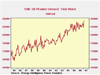
There are 86,400 seconds in a day: 24 hours x 60 minutes x 60 seconds. In February, according to the Oil Market Intelligence publication of industry consulting firm Energy Intelligence, the world consumed 87,069 million barrels of petroleum products, a new monthly record. That amount equals 1,007 barrels every second. Haver carries the daily average demand information in its OMI database, offered in partnership with Energy Intelligence. The idea for this time calculation is not ours, though. It comes from an investment consultant in the field, Peter Tertzakian, author of a book published last year titled, appropriately enough, "A Thousand Barrels a Second".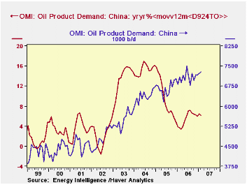
February's daily oil consumption for the total world was up 3.4 million barrels from January (4.1%), although February demand is frequently high, and this was just 1.5% above February 2006. A notable part of the increase came in the US, where demand was 21.6 million barrels daily, 5.4% more than a year ago. The US experience is clearly a spike and as with other economic data for the month -- jobs in the construction industry and retail sales, for examples -- was likely related to the swing to unusually cold weather, particularly compared with mild February weather last year.
Even with this February rise, the US share of world oil consumption is no higher than it has been running over the last couple of years: just under 25%. These data illustrate well what we've heard more casually elsewhere: the significant growth in oil consumption is coming from developing regions of the world. For instance, in China, the last 12 months' average has been 7.1 million barrels daily, 6.2% ahead of the 12 months ended February 2006.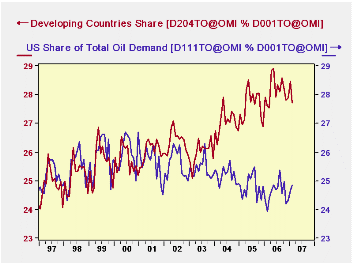
From the third graph, we can see that the US share of the world total over a longer period, since 2000, has actually declined. In dramatic contrast, the OMI grouping called "developing countries"* has gained share. From 26.4% in 2002, those countries expanded to 28.0% in 2006.
These graphs illustrate some upcoming innovations in Haver's DLXVG3 software. In the Chinese example, we were able to take a percent change in a moving average, utilizing a new "nested function" capability. In the market share graph, we were able to make two separate calculations involving three different series. Elsewhere this past week in several of Robert Brusca's articles, you have seen three or even four series on a single graph. These new features will be available to clients soon and we're very excited about them.
| Daily Average Oil Demand: Thousand Barrels | Feb 2007 | Jan 2007 | Feb 2006 | 2006 | 2005 | 2004 |
|---|---|---|---|---|---|---|
| Total World | 87,069 | 83,653 | 85,796 | 84,475 | 83,838 | 82,287 |
| Yr/Yr % Change | 1.5 | 0.1 | 0.3 | 0.8 | 1.9 | 4.3 |
| United States | 21,632 | 20,618 | 20,518 | 20,768 | 20,799 | 20,731 |
| China | 7,276 | 7,222 | 7,107 | 7,074 | 6,675 | 6,367 |
| Developing Countries* | 24,135 | 23,804 | 23,675 | 23,760 | 23,160 | 22,251 |

Robert Brusca
AuthorMore in Author Profile »Robert A. Brusca is Chief Economist of Fact and Opinion Economics, a consulting firm he founded in Manhattan. He has been an economist on Wall Street for over 25 years. He has visited central banking and large institutional clients in over 30 countries in his career as an economist. Mr. Brusca was a Divisional Research Chief at the Federal Reserve Bank of NY (Chief of the International Financial markets Division), a Fed Watcher at Irving Trust and Chief Economist at Nikko Securities International. He is widely quoted and appears in various media. Mr. Brusca holds an MA and Ph.D. in economics from Michigan State University and a BA in Economics from the University of Michigan. His research pursues his strong interests in non aligned policy economics as well as international economics. FAO Economics’ research targets investors to assist them in making better investment decisions in stocks, bonds and in a variety of international assets. The company does not manage money and has no conflicts in giving economic advice.
More Economy in Brief