Global| Apr 08 2019
OECD LEIs Flash Slowdown!
Summary
The OECD leading indicators are barometers of economic activity; they are available for a broad set of countries. These indicators show declining LEI values on a broad array of countries and regions with a time series of weakness in [...]
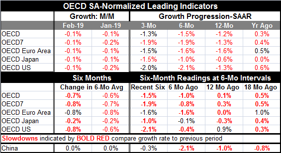
 The OECD leading indicators are barometers of economic activity; they are available for a broad set of countries. These indicators show declining LEI values on a broad array of countries and regions with a time series of weakness in train as well for each. The top panel in the table below shows growth rates in the LEIs on conventional three-month, six-month, and 12-month horizons. The bottom panel shows sequential six-month growth rates as the OECD likes to look at the LEI signal over six-month periods.
The top panel shows a lot of weakness and declining indexes with annualized growth rates revealing weaker as well as weak growth in their most recent periods for the OECD-7 and for Japan. The U.S. the euro area and the whole OECD are just short of exhibiting the same continually decelerating pace.
The bottom panel shows changes over six months on average and then shows sequential six-month periods that reveal a great deal of weakness with declining LEIs everywhere and with the pace generally getting sequentially weaker as well. This is a picture of a broad slowing in the global economy. China echoes this weak (and weakening) growth performance.
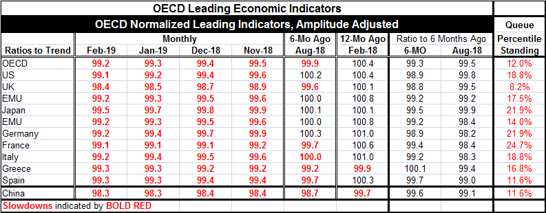
Looking more specifically at countries we find for the last four months all members in this table have index values below 100; that shortfall indicates some degree of slowdown. In addition, seven of twelve of these countries/areas show readings below 100 for six months ago. 12 months ago most of them had LEI values above 100 (China and Greece were exceptions). However, the ratios of the current month to six-months ago and of six-months ago (Aug-18) to six-months before that show values below 100 that indicate that the indicators have been slipping on these broad horizons. So we have two weakening criteria in this table: low-valued LEI readings and progressive deterioration. The third one is the low queue percentile standings in the far right hand column, where 50% indicates the median and all are weaker than that. In fact, the strongest does not reach its 25th percentile standing.
 The chart shows how LEI growth rates plot against the historic U.S recession bands. The chart also shows that there is little difference between the OECD signals and the U.S. economic signals. As goes the U.S., so goes the OECD. That isn’t very surprising.
Developing economies show weakness too
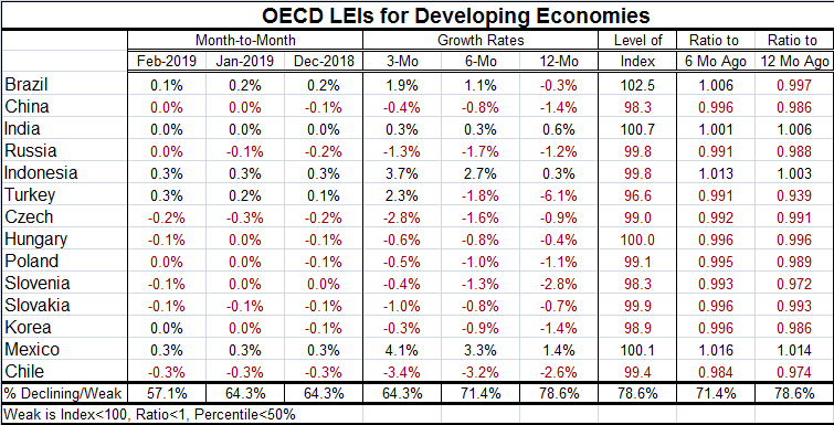
Next we have a table of developing economy metrics. The bottom of the table creates a summary statistic relevant to the data in the column above it. The summary signals are defined such that high values indicate greater weakness. All the summary statistics show readings above 50% indicating more weakness than strength in the various columns. The first three columns show month-to-month changes in the LEIs and these are showing declines ranging from 57% of the group to 64% of the group (the percentages are constructed from the full data string not from the values in the table). Next sequential growth rates from 12-month to six-month to three-month, show somewhat diminishing weakness with the percent of negatives falling from 78% over 12 months to 71% over six months and to 64% over three months. Brazil, India, Indonesia and Mexico emerge as the strongest countries in this matrix of data. Looking at index levels as well there are only three: Brazil, India and Mexico, with index values above 100. The next two columns look at the ratio of the index to six-months ago and to 12-months ago both show 70% or greater weakness. Finally, the percentile standings of the LEIs show only Brazil, India and Mexico with standings above their respective medians (values over 50%). Hungary and Slovakia come close. The weakest standings are from China, Turkey, Slovenia, Poland and South Korea, a significant group.
The message from the LEIs is pretty clear. There is true global weakness. The weakness can be seen the levels of activity, proxied by the levels of the LEIs. It can also be seen in the eroding momentum that is evident from changes in the indicators over periods of time or ratios of current indexes to older values. Finally, simply evaluating the level of the index relative to historic values shows that most current readings do not compare well with their own histories.
The global slowdown is real. It is an industrialized country phenomenon and it is a developing economy phenomenon. China and the EMU are especially weak. But the U.S. is doing poorly as well despite its better GDP performance. Its current LEI index is low and its growth rate is gaining downward momentum rapidly
 U.S. and China
The final chart looks the U.S. and China vs. the U.S. recession bars. Before 2000, the U.S. and China seemed to go their own way a lot. But since 2000, China and the U.S. have been more or less rising on the same cycles with China’s amplitudes generally exaggerated when compared to the U.S. China does not seem to have changed the game that much. Of course, there is nothing here that speaks to how one country’s cycle might have or might be affecting the cycle in another country. But if we view these as largely independent movements what we see is that they have become almost as well synchronized as the U.S. to OECD cyclical developments. And the conclusion from that, of course, is that these are not independent movements but rather codependent movements.
Conclusions
It is easy to see from these charts why the IMF is saying that the pause in raising interest rates in the U.S. and the move to stimulus in Europe are welcome developments. Current momentum is not good nor is the slowing welcome at a time that inflation pressures are still largely dormant. Interestingly, also at this point in time but for weather and geopolitical reasons, oil prices have been gaining. Floods in the U.S. have disrupted ethanol supplies and raised gasoline prices. With the military action in Libya and the ongoing problems in Venezuela, oil prices have been able to firm amid sagging global growth rates...at least for the moment. But oil is hardly in short supply; we will see how long these geopolitical disruptions last and how long oil prices can firm as growth weakens.

Robert Brusca
AuthorMore in Author Profile »Robert A. Brusca is Chief Economist of Fact and Opinion Economics, a consulting firm he founded in Manhattan. He has been an economist on Wall Street for over 25 years. He has visited central banking and large institutional clients in over 30 countries in his career as an economist. Mr. Brusca was a Divisional Research Chief at the Federal Reserve Bank of NY (Chief of the International Financial markets Division), a Fed Watcher at Irving Trust and Chief Economist at Nikko Securities International. He is widely quoted and appears in various media. Mr. Brusca holds an MA and Ph.D. in economics from Michigan State University and a BA in Economics from the University of Michigan. His research pursues his strong interests in non aligned policy economics as well as international economics. FAO Economics’ research targets investors to assist them in making better investment decisions in stocks, bonds and in a variety of international assets. The company does not manage money and has no conflicts in giving economic advice.
More Economy in Brief