Global| Aug 30 2013
Euro Area Is on the Rise, but Is It on the Mend?
Summary
Both the overall EU and the EMU measures of Sentiment rose sharply in August 2013 compared to July. The EU index rose to 98.1 from 95. Going back to 1985 this is the ninth largest month-to-month change in that overall index. Similarly [...]
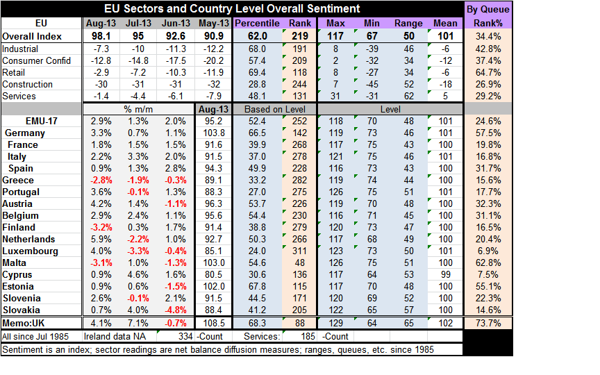
 Both the overall EU and the EMU measures of Sentiment rose sharply in August 2013 compared to July. The EU index rose to 98.1 from 95. Going back to 1985 this is the ninth largest month-to-month change in that overall index. Similarly the month-to-month EMU index was large and posted it's seventh largest gain over that time span led by the Netherlands with its fourth-largest change and by Germany with its eight largest change. (Note that EMU readings are extended back prior to the actual formation of the Zone using weights to establish the pre-EMU index and calculate data.) Lagging behind on this interval that spans 334 months for the longest-standing members of the Community are Finland and Greece whose monthly changes are declines and rank as 297th -right near the historic bottom of their queue of changes. The recovery is the rising tide, it also a rising tide that does not raise all boats- just most of them- but not all of them by the same amount. It's a strange tide.
In the queue rankings of the various EU components as well as the country level measures we see clearly that the Zone is still struggling. The ranking of the overall Zone index in the 34th percentile of its queue: that leaves it just barely above the lower one third of its historic range. The services sector which tends to be the job creation sector reports the relatively lowest queue standing in the 29th percentile of its historic queue. The relatively strongest category is retailing in the 65th percentile of its queue - closer to the top third of its rank. The industrial sector is in its 43rd percentile. Consumer confidence is lagging behind in the 37th percentile. The construction sector is in the 27th percentile of its historic queue.
When we look at the country measures relative to their historic average only the UK, Germany, Malta and Estonia are above their historic averages. For Germany the average is calculated a period of 334 months for Malta it's 129 months and for Estonia that's 256 month. The UK calculation also spans a full 334 month period. The UK index stands a full 6.4 percentage points higher its historic average that's quite impressive. And when we evaluate these measures in their respective historic queues the UK has the best standing among them in the 73rd percentile of its queue. Malta is at the 67th percentile. Germany is at the 57th percentile and things drop away quickly after that with Estonia at the 55th percentile and so on. The three largest EMU countries after Germany, France Italy and Spain reside in their 19th 16th and 31st percentiles, respectively.
Percentiles are constructed so that the 50th percentile is the median value for each country. Most remain far below their historic medians. The weakest countries on their historic queue metric are Luxembourg, in the lower 6.9 percentile of its historic queue, and Cyprus, in the lower 7.5 percentile of its historic, queue followed by Slovakia in the 14.6 percentile; from there we go up to Greece in the 15th percentile and to the 16th percentile which includes readings for Finland and Italy and so on.
The view that Europe has improved is quite clear from the chart above where country measures are moving up. Sector readings for the whole of the EU are moving up, too. However, they remind us that the industrial sector, consumer confidence, retailing, construction and services all continue to post readings in negative territory and in each case they are readings below their respective means.
It's interesting to note that some of the indicators are actually quite close to their means, for example the industrial index at -7.3 is close to being at its mean of -6 (yes, its mean is negative on this period). Consumer confidence at -12.8 is close to its mean of -12. Services, however, posted a relatively higher diffusion reading in August at -1.4 compared to the other indices yet, it is still in bad shape relative to its mean which is a positive number at +.5.0.
To look at the indicators relative to their means we get some idea of how weak they are but these assessments do not match well with the queue rankings. With the queue assessments we get a different view, one that is somewhat more critical.
This difference essentially revolves around the difference between assessing something by its average versus median. We can understand the queue rankings as being a `high to low' ordering without regard to the actual value of the observation. But we can also understand the queue orderings as being relative to each component's median, where the median value is at 50%. The fact that the ranking values give lower readings than the gaps with the mean might suggest, tells us something about the distribution of observations of the various components over the various business cycles
This result seems to suggest that there are relatively more observations in the lower part of the distribution or that the observations in the upper part of the distribution or that there tend to be more observations at lower extremes than are the high observations in the upper part of the distribution. This is because the mean reading causes the current observation is to look relatively more normal while the queue observations see more weakness relative to historic ranking. . We can see some of this in action from the metric describing EU overall index. Its mean is 101; its maximum value is 16 points higher...but its minimum value is 34 points lower!
Queue percentiles that place each monthly reading in its ordered queue, do so only with respect to ordering and never with respect to the value of the actual observation at that point of the ordering and without any respect to the gap between one observation and the next. In the lexicon of the queue ordering, higher is higher and lower is lower regardless of by how much.
Queue standings tell us more about the amount of time that the various variables spend lower versus higher rather than telling us `by how much' they are higher or lower. It's a different approach. The overall index at the 34.4th percentile, as I mentioned earlier, means that the overall index is just above the lower one third of its queue. That in turn means that the index is weaker than this only about one third of the time (since all units of time are equal in the queue, equal to one-month in this case). If you look at the current value at 98.1 compared of the mean at 101, the values appear relatively close but it's hard to know what those three percentage points (2.9) really represent. And we don't really know the answer to that without some experimentation because the amount by which the queue reading will move if you shift the observation from 98.1 to 101 will depend upon the density of the distribution over that interval. However, when we perform the experiment, and put the overall index at its mean, we find the mean is only in the 44th percentile of its queue historically. The mean is below the median, of course.
It may seem a bit nerdy to think about these statistics, but the meaning of these various differences is helpful to understandings what the diffusion indices represent. Perhaps after the above experiment you can to understand why I prefer to look at the queue rankings to understand what the diffusion readings really mean.
For those who want to know about `strength, remember that the diffusion indices measure the breadth of a trend and do not measure strength per se. More precisely when we apply rankings to the raw diffusion indices we are ascertaining how much often that diffusion breadth is greater or less than it is at the current time.
Proponents of diffusion indices, whether using the net indices provided by the EU Commission and the Philadelphia Fed (and others) or by the type offered by the ISM in the United States, are limited. The surveys taken by the user the way that they are presented, offer only one meaningful number, and that's either the number 50 in the case of the ISM or the number zero in the case of the net readings. These formats try to glorify the idea that production is either expanding or declining, that orders are either growing or shrinking, that prices are either rising or falling, and so on. And of course here `expanding,' `growing," and "rising" refer to breadth.
You can plot the raw diffusion figures historically and get an idea of what a particular indicator value means. But that leaves you with inductive eyeballing or citing the strengths of the current figure as the highest/lowest since XXX, and so on.
The diffusion readings when filtered through the eyes of the queue percentile readings have an immediate and precise meaning. This treatment fits my notion that we are really more concerned with whether the various sector readings and overall readings are better understood when they are evaluated as being better worse than `normal' or usual. What is more `usual' that the point that divides the distribution equally between its highest and lowest observations? Therefore, the median is actually a very good yardstick. But rather than glorifying the 50% level in the queue, the point of percentile rankings is that it's intuitively obvious what it means to be in the upper third or lower third of a rank distribution.. Or, for that matter, to be in the top quarter or the lower quarter. or even to be in the top 10% or bottom 10%. The statistics are immediately meaningful an do require further context.
I believe that all diffusion indices should be filtered through this kind of a process. As it is, if you look at the various components, regardless of the diffusion survey, components all have different average tendencies different ranges over which they vary (even though their theoretical range is strictly limited and identical across components under each respective format; either 0 to 100 or -100 to +100). Moreover, components have different intrinsic volatility. All of that means that when you look at the component's value in a survey you can't compare component values eve from the same survey. If you did that this month in EU survey, you would conclude that the service sector is the strongest sector. That would be incorrect, as, in fact, relative to its history it is actually the weakest sector/component. Using queue rankings instead, you can compare readings across components; it allows you to compare different readings across countries as well.
If the German economy tends to be the strongest economy in the euro-Zone, then, historically, it will tend to have the highest readings. And when we evaluate Germany, we want to evaluate the German economy relative to its own standard not relative to some arbitrary level that may not have any particular meaning for it. Similarly, for a weak economy we will want to evaluate it relative to its own historic performance to understand how it's doing - relatively. We understand that if the German economy is in the top 25% of its range and the Greek economy is in the top 25% of its range that while we know something about the relative performance of each of these economies as being `the same' we also know that it means different things for each country. We know that they are in very different shape because they are very different economies.
So, as the euro-Zone continues to notch better numbers, we continue to point to these queue rankings to remind us how weak the euro-Zone still really is. The UK economy has clearly moved up to a point where it is relatively more solid although we know in the background it has some severe banking sector problems it is going to have to deal with. We also know that its performance is in some sense not an `Olympic record' because it is aided by a strong tail-wind wind that's been created by the central bank. Not even the queue rankings can tell you everything. You still have to think.

Robert Brusca
AuthorMore in Author Profile »Robert A. Brusca is Chief Economist of Fact and Opinion Economics, a consulting firm he founded in Manhattan. He has been an economist on Wall Street for over 25 years. He has visited central banking and large institutional clients in over 30 countries in his career as an economist. Mr. Brusca was a Divisional Research Chief at the Federal Reserve Bank of NY (Chief of the International Financial markets Division), a Fed Watcher at Irving Trust and Chief Economist at Nikko Securities International. He is widely quoted and appears in various media. Mr. Brusca holds an MA and Ph.D. in economics from Michigan State University and a BA in Economics from the University of Michigan. His research pursues his strong interests in non aligned policy economics as well as international economics. FAO Economics’ research targets investors to assist them in making better investment decisions in stocks, bonds and in a variety of international assets. The company does not manage money and has no conflicts in giving economic advice.
More Economy in Brief