Global| Oct 09 2025
Charts of the Week: Shutdowns and Shake-Ups
by:Andrew Cates
|in:Economy in Brief
Summary
Financial markets have been navigating a US government shutdown that has frozen key data releases and muddied the macro picture, while political cross-currents in Europe and Asia have added to the noise—France has seen yet another prime minister resign, while Japan’s leadership change is being read as a tilt toward easier fiscal policy. With official US data dark, investors are leaning on proxies—such as Haver’s state-sum jobless-claims series—to keep tabs on labour market momentum (chart 1). From there, our remaining charts this week point to an uneven global macroeconomic story: US labour productivity has remained well ahead of peers, a lead that maps closely to cheaper electricity—where power costs are low, capex and margins hold up; where they’re high, manufacturing strains and measured productivity sag (charts 2 and 3). Yet produced capital continues to climb even as natural capital per capita erodes, helping to keep real energy costs sticky and weighing on the world’s productivity fabric (chart 4). In markets, Japanese equities have surged on policy-support hopes even as yen softness lingers (chart 5), and in emerging Asia, Vietnam’s Q3 GDP shows re-acceleration and firming domestic demand, though exposure to evolving US tariff policies is keeping the export outlook uncertain (chart 6). Net-net: growth pockets persist, but high real energy costs, policy shifts, and patchy visibility argue for a choppy, bifurcated path ahead.
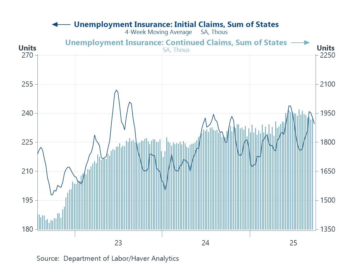
US labour market data With the federal government shut down, several key US data releases have been suspended, including the Department of Labor’s national jobless‐claims reports that normally anchor weekly readings on labour-market momentum. To maintain visibility, the chart uses Haver Analytics’ state-sum methodology—adding up the figures published by individual state agencies to create a near-real-time proxy for the national series. The dark line shows the 4-week moving average of initial claims derived from this state-level aggregation, while the shaded bars plot the corresponding state-summed continued claims. Although not an official federal release, this construction provides an updated snapshot of layoffs and ongoing benefit rolls during the shutdown period, helping analysts track any softening or resilience in labour demand until the Department of Labor’s headline numbers resume.
Chart 1: US Jobless Claims – Haver Calculations
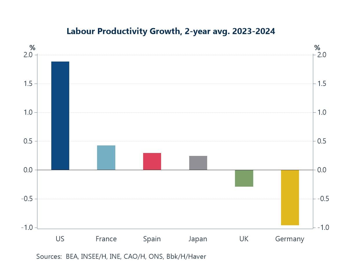
Labour productivity trends As the next chart below indicates the US has outpaced peer economies on labour productivity in recent years. That’s a function of a number of factors including faster capital deepening and - arguably - a quicker diffusion of digital technologies. Surging investment in software, cloud and data-centre infrastructure—bolstered by deep capital markets and policy supports—has lifted output per hour in tech-heavy sectors and spilled over into business services. A flexible labour market has also arguably reallocated workers toward higher-productivity firms more rapidly than in Europe or Japan. Sector mix and energy costs matter too: the US has a much larger footprint in high-value services and enjoyed a relative energy-price advantage since 2022, while Germany and the UK faced an energy-intensive manufacturing slump that depressed measured productivity.
Chart 2: Labour productivity growth in advanced economies
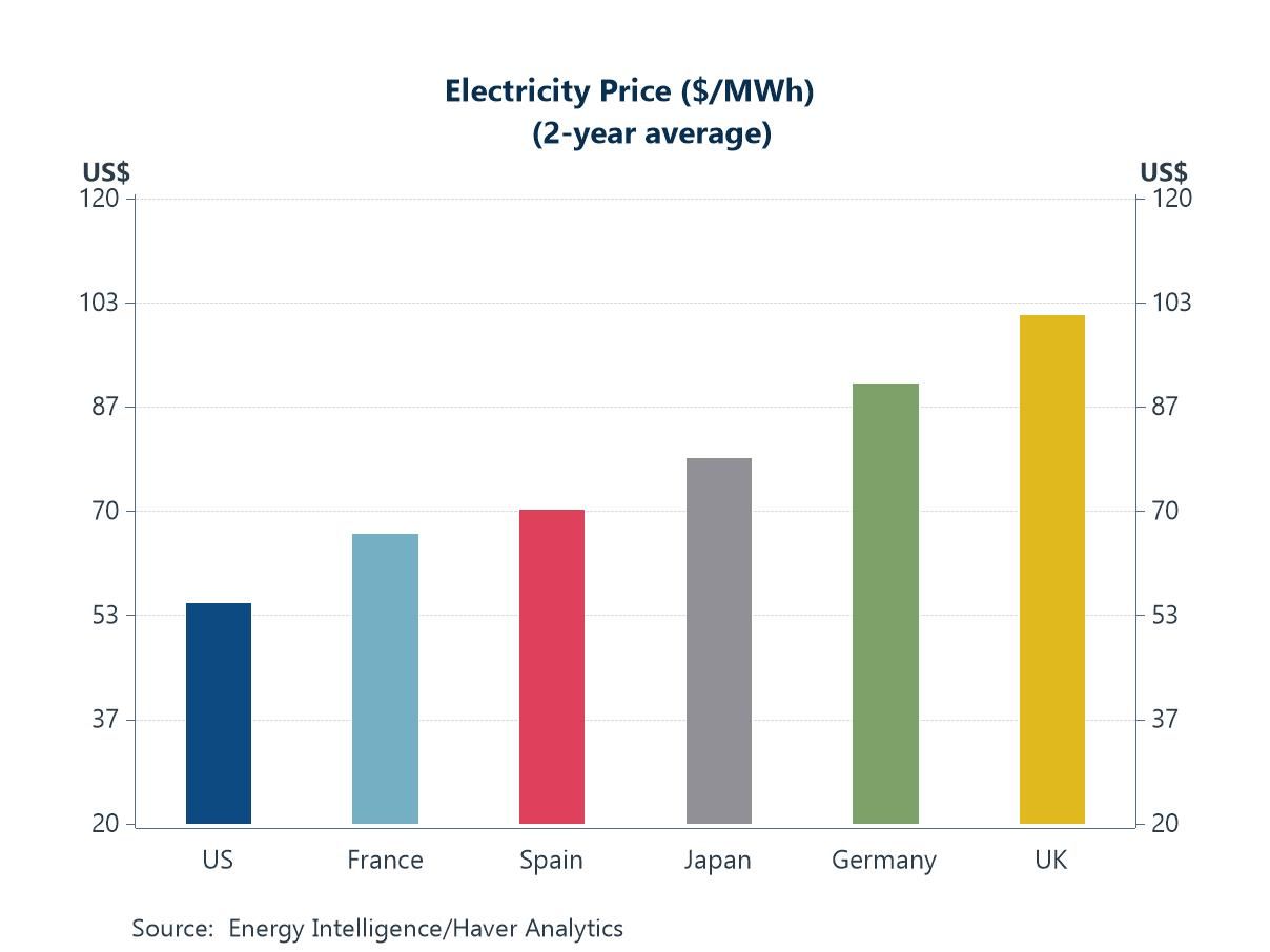
Electricity prices That linkage shows up starkly in electricity costs. The two-year average electricity price has been far lower in the US than in Europe or Japan, with France and Spain higher, Japan higher still, and Germany and the UK at the top end. The mapping to productivity is almost one-for-one: cheaper power supports capex, keeps energy-intensive inputs and data-centre compute affordable, and sustains margins in high-value services; expensive power squeezes manufacturers, curtails utilisation, and drags on measured output per hour. In other words, the same energy-price wedge that has undercut Germany and the UK since 2022 has amplified the US edge—helping explain why recent productivity gains have clustered where electricity is cheapest.
Chart 3: Domestic electricity prices, 2-year average
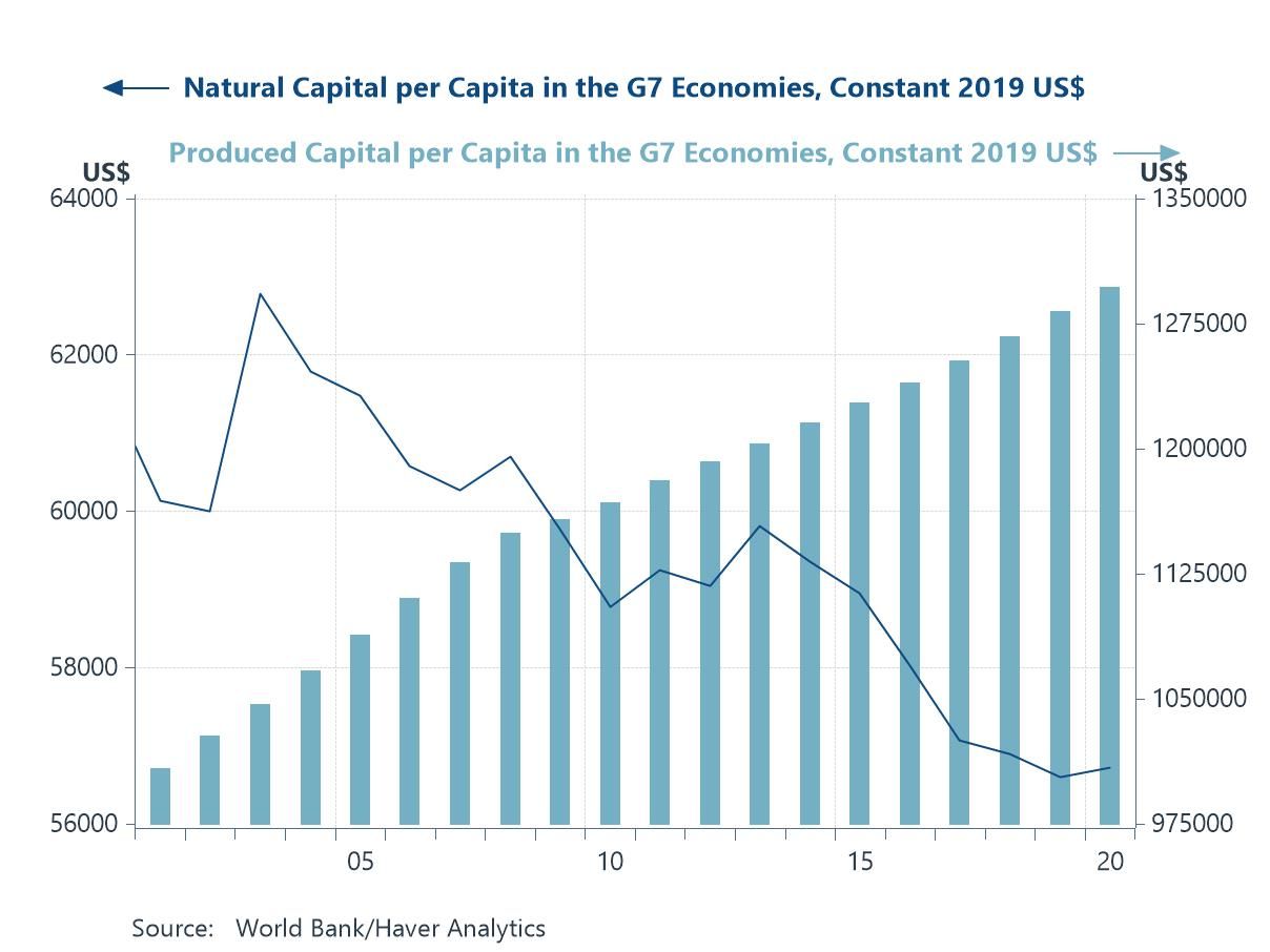
Natural capital The split in the next chart is telling: while produced capital per capita across the G7 economies has marched higher, natural capital per capita has drifted lower for most of the past decade. That erosion has arguably become central to the more active debate about why global productivity has struggled—depleted natural assets and tighter environmental constraints tend to raise real (inflation-adjusted) energy costs, increase maintenance and mitigation spending, and divert investment from expansion to replacement and resilience. In practice, more capex goes into hardening grids, meeting environmental standards, remediating land and water, and sourcing costlier energy inputs—outlays that protect activity but add less to measured output per hour. The result is a thinner productivity fabric: higher operating costs, slower diffusion of new capacity, and weaker multiplier effects from investment. In short, the gains in produced capital are increasingly offset by the drawdown of natural capital.
Chart 4: Natural capital per capita versus produced capital per capita in the G7 economies
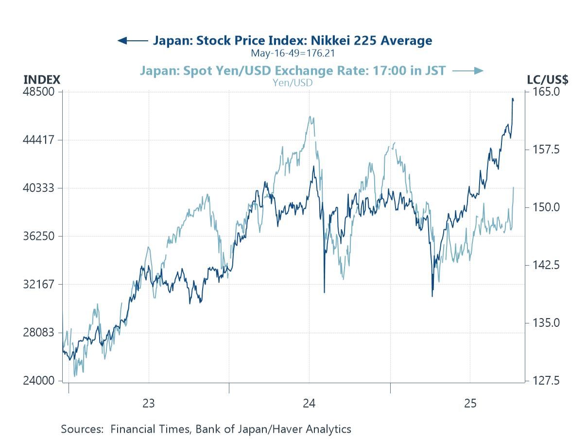
Japan’s politics Turning to Japan, politics has become the market driver. The leadership change in Tokyo over the past few days has been read as a green light for a more stimulative fiscal stance—and, by extension, a slower or softer path for Bank of Japan normalization of monetary policy. That mix has pushed domestic risk assets higher while taking some of the support out of the yen. In the chart, the Nikkei 225 has surged to fresh highs as investors price stronger nominal growth and policy backstops, whereas the yen has slipped against the dollar, reflecting expectations of wider policy differentials. The combination of easier fiscal, a still-accommodative BOJ, and a weaker currency has reinforced the equity rally—especially in exporters and cyclicals—even as it raises questions about the durability of yen weakness if inflation proves sticky.
Chart 5: Japan’s financial markets: The Nikkei 225 average versus the USD/JPY exchange rate
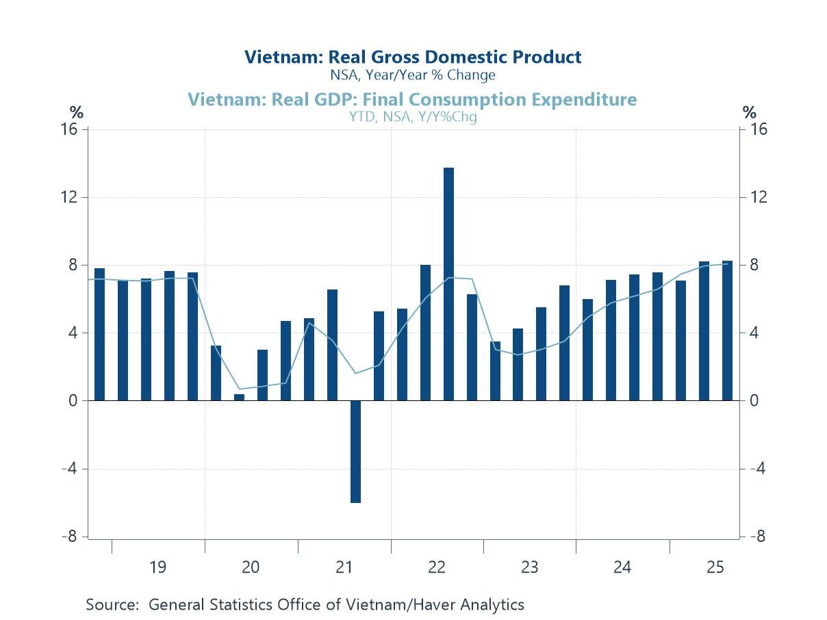
Vietnam’s economy Vietnam has been in the headlines this week with Q3 GDP showing a steady re-acceleration. As the final chart below indicates, real GDP growth is pushing back toward the top of its post-pandemic range, with year-to-date household consumption firming alongside it—signs that the recovery is broadening beyond exports. Tailwinds include a rebound in electronics orders, ongoing supply-chain diversification into Vietnam, tourism’s return, and earlier monetary easing. But the outlook is not without hazards: escalating US tariff policies—both broad measures and sector-specific actions on tech and green goods—could disrupt export demand and complicate rules-of-origin strategies that currently favour Vietnam as a “China-plus-one” hub. Add lingering property-sector repair and infrastructure bottlenecks, and the near-term growth path remains constructive but sensitive to US trade developments.
Chart 6: Vietnam’s GDP growth

Andrew Cates
AuthorMore in Author Profile »Andy Cates joined Haver Analytics as a Senior Economist in 2020. Andy has more than 25 years of experience forecasting the global economic outlook and in assessing the implications for policy settings and financial markets. He has held various senior positions in London in a number of Investment Banks including as Head of Developed Markets Economics at Nomura and as Chief Eurozone Economist at RBS. These followed a spell of 21 years as Senior International Economist at UBS, 5 of which were spent in Singapore. Prior to his time in financial services Andy was a UK economist at HM Treasury in London holding positions in the domestic forecasting and macroeconomic modelling units. He has a BA in Economics from the University of York and an MSc in Economics and Econometrics from the University of Southampton.
More Economy in Brief