Global| May 04 2007
U.S. Job Growth: The Conundrum Deepens
Summary
Australia's balance of trade in goods and services moved further into deficit in March as exports declined and imports continued increasing. The overall deficit was A$1,622 million, up from A$728 million in February (seasonally [...]
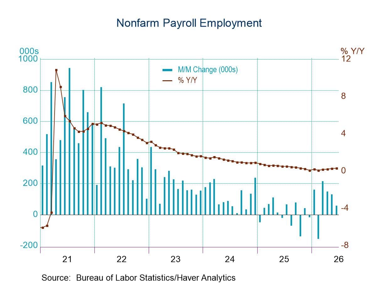
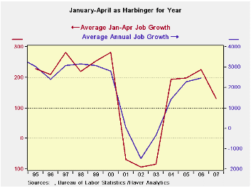 Jobs growth slows in April as the trend also slipped into a slower gear, manufacturing performs much worse than the ISM predicts while construction job growth edges lower and hits neutral for the year. Services job growth is slower, but boosted by government hiring. The unemployment rate makes a minor up-tick to 4.5%. ‘Wage’ growth slows in April. All this is against a background of a more recent weekly jobless claims reading that is just above the 300K mark. What can all this mean? Jobs growth slows in April as the trend also slipped into a slower gear, manufacturing performs much worse than the ISM predicts while construction job growth edges lower and hits neutral for the year. Services job growth is slower, but boosted by government hiring. The unemployment rate makes a minor up-tick to 4.5%. ‘Wage’ growth slows in April. All this is against a background of a more recent weekly jobless claims reading that is just above the 300K mark. What can all this mean?The table below summarizes and provides trends for the most important of the labor market gauges we follow. Jobs trends - be they Total, Private, Construction, Manufacturing or Services show clear withering trends. Still the counter point cannot be set aside: it asks if the trends are really continuing to wither or if they have just transited to a slower pace now that there is less available labor (4.5% unemployment). Maybe the stability at the slower pace is not clear. At current population growth, we need to average about 130K jobs per month and that is about what the economy is doing year-to-date in 2007 (129k). Has it slowed or is it still slowing? With job growth for April in hand it is fair to ask what we can now project for the year ahead. With April we now have 4 months of the year’s 12 in hand or estimated. The graph above has plotted average January-April job growth VS the actual outturn for the year. The chart shows a pretty good tracking. Indeed January-April explains about 88% of the variability in annual average job growth. If we focus on the ability of the first four months to predict the average over the last seven months (a tougher job at prediction), January-April has an R-squared of 0.91 with actual average growth from May-December. So the statistics of it all say that the slow down is for real and will stay in this lower range of about 130k for the rest of the year. Of course there is no guarantee that no shock will damage the economy and send it lower in 2007-H2. But statistics tell us that first four months are good predictors of the last seven. All that means is that through the first four months the balance of the seasonal factors is pretty fair. In the past twelve years April has had an average absolute miss of the second half of the year (last seven months) that averaged 35K. It has missed six times on the upside with an average miss of 28K and six times on the down side with an average miss of (minus) 40K.All this fits in with what we observe. That the economy’s rate of unemployment (despite rising in April) is lower year-over-year as job growth has slowed. This suggests that the recovery is more mature rather than that plunging headlong into recession.Slowed or slowing? A second look: However, we know that January-April can’t ‘know’ what is in store for May-Dec. Our calculation above is simply to show that a slowdown that persists is perfectly consistent with the numbers we have observed so far. Just as obviously, a slowdown that cumulates could also be in the cards. 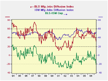 The graph on the left looks at a second set of relationships: This set is for the labor department’s (BLS) manufacturing jobs diffusion number and the ISM’s manufacturing jobs diffusion number. Separately we graph on the bottom the value of the gap between these two series, each of which purports to measure the same thing. We look to se if the gap is in anyway predictive. Her we notice that the ISM’s survey just does not have the range of the BLS report. The BLS trend gets weaker sooner and gets much weaker than the ISM report. The same is true on the upside with strength. So the gap is a directional statement on the manufacturing sector. Not only is the BLS manufacturing gap with the ISM’s reading for the labor market getting bigger, but, the BLS reading has a very persistent downward trend. At a reading of 32.1 it is just barely within the UPPER part of the range of values for that statistic for the period when the economy was in recession and manufacturing was so weak. The gap is fully within the range for the set of values from that period. Viewed as a DIAGNOSTIC, this is a very ominous reading. The graph on the left looks at a second set of relationships: This set is for the labor department’s (BLS) manufacturing jobs diffusion number and the ISM’s manufacturing jobs diffusion number. Separately we graph on the bottom the value of the gap between these two series, each of which purports to measure the same thing. We look to se if the gap is in anyway predictive. Her we notice that the ISM’s survey just does not have the range of the BLS report. The BLS trend gets weaker sooner and gets much weaker than the ISM report. The same is true on the upside with strength. So the gap is a directional statement on the manufacturing sector. Not only is the BLS manufacturing gap with the ISM’s reading for the labor market getting bigger, but, the BLS reading has a very persistent downward trend. At a reading of 32.1 it is just barely within the UPPER part of the range of values for that statistic for the period when the economy was in recession and manufacturing was so weak. The gap is fully within the range for the set of values from that period. Viewed as a DIAGNOSTIC, this is a very ominous reading.ON THE OTHER HAND - as economists are inclined to say… The manufacturing sector is weak and has been weak. The finding that it is still weak is not much of a surprise. It is the finding that manufacturing job market is weaker than the ISM says that is an interesting ‘signal’. Can we do the same thing for nonmanufacturing, since that’s where most of the jobs are? There is a nonmanufacturing ISM. But the Labor Dept only gives us manufacturing and total diffusion – not, nonmanufacturing diffusion. But with some trickery we can GIN UP an estimate of its nonmnufacturing number. I do this by applying employment weights to manufacturing Vs nonmanufacturing jobs and extracting the implicit nonmanufacturing estimate from the nonfarm total diffusion number. After taking the employment-weighted value out for manufacturing, a nonmanufacturing estimate is left. When I do that the chart below can be made. 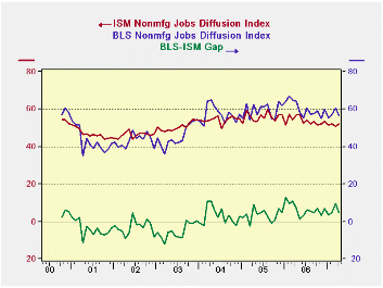 The second chart shows (of course!) a result that is essentially OPPOSITE to that for manufacturing. While the manufacturing sector is getting weaker in the BLS framework, the implied service sector readings are getting stronger. Indeed the GAP between the ISM nonmanufacturing and the implied BLS take on the sector are in fact narrowing. Here, the ISM is showing weakness that is NOT corroborated by the BLS implied measure. And while the nonmanufacturing ISM has not been around for long, it does show – similar to the manufacturing relationship-- that when the economy is weak (see 2000 and 2001) the BLS numbers weakens faster than the ISM numbers for nonmanufacturing industries. Therefore the series, although it is constructed, seems to give off signals that are reasonably good. In the past, this signal was reasonably descriptive of the times, so why ignore the current signal?We conclude that this report tells us very little new about the economy that we did not already know. We knew that jobs growth had slowed. We knew that manufacturing was weak. We knew that the service sector was holding things up. While no calculation can reassure you that things are not getting worse, there is some body of data that suggests such an ‘optimistic’ view is consistent with the facts. Plus the nonmanufacturing job signal is the more important one of the two conflicting sector signals since manufacturing jobs are such a small proportion in this economy. Moreover…there is always the weather to blame There is always that report on the weather that can be salvation for a view that is not getting its due. Once again in April it was ‘cloudy with a chance of meatballs’ - another odd weather result. The Household report shows that 107K workers were unable to work due to inclement weather. This is above the average for April which is 71K. The range for April is a high of 131K and a low of 36K. In other terms these data say that April’s result was in the top 25% of all Aprils in terms of the magnitude weather disruption. The degree of disruption was 50% greater than it is on average in April. It is not clear if we should add the 36k count to employment since this is a household report survey finding and it does not tell if the affected worker was white collar (and therefore still counted as employed) or blue collar (and perhaps not counted, but perhaps still counted as long as the worker was still on the payroll in the survey week). On balance weather may have skewed the reading, making it lower.IN CONCLUSION It will take at least another month to see if this trend lower extends itself (a disturbing prospect) or if it rights itself and tends to confirm the growth has really only has stabilized at a slower pace. We will also want too look at the steep drop in household employment for the month. I tend to look at the unemployment rate that renders the vagaries within the HH report neutral (The household survey, the source of the unemployment rate calculation). That is to say that the unemployment rate is a very stable result even though it is based on two numbers, ‘labor force’ and ‘unemployed’ that are themselves quite unstable. In the past when there is a huge HH shift for employment or unemployment it is undone usually in the following month. For that reason we are best offsetting the household report aside. It was an early Easter this year. Easter migrates around the calendar and we have seen a lot of distortion because of that in other figures so far this year. It is a good bet that when we get new readings for the month of May we will be blaming the Easter Bunny for volatility rather than worrying about a weak economy. The second chart shows (of course!) a result that is essentially OPPOSITE to that for manufacturing. While the manufacturing sector is getting weaker in the BLS framework, the implied service sector readings are getting stronger. Indeed the GAP between the ISM nonmanufacturing and the implied BLS take on the sector are in fact narrowing. Here, the ISM is showing weakness that is NOT corroborated by the BLS implied measure. And while the nonmanufacturing ISM has not been around for long, it does show – similar to the manufacturing relationship-- that when the economy is weak (see 2000 and 2001) the BLS numbers weakens faster than the ISM numbers for nonmanufacturing industries. Therefore the series, although it is constructed, seems to give off signals that are reasonably good. In the past, this signal was reasonably descriptive of the times, so why ignore the current signal?We conclude that this report tells us very little new about the economy that we did not already know. We knew that jobs growth had slowed. We knew that manufacturing was weak. We knew that the service sector was holding things up. While no calculation can reassure you that things are not getting worse, there is some body of data that suggests such an ‘optimistic’ view is consistent with the facts. Plus the nonmanufacturing job signal is the more important one of the two conflicting sector signals since manufacturing jobs are such a small proportion in this economy. Moreover…there is always the weather to blame There is always that report on the weather that can be salvation for a view that is not getting its due. Once again in April it was ‘cloudy with a chance of meatballs’ - another odd weather result. The Household report shows that 107K workers were unable to work due to inclement weather. This is above the average for April which is 71K. The range for April is a high of 131K and a low of 36K. In other terms these data say that April’s result was in the top 25% of all Aprils in terms of the magnitude weather disruption. The degree of disruption was 50% greater than it is on average in April. It is not clear if we should add the 36k count to employment since this is a household report survey finding and it does not tell if the affected worker was white collar (and therefore still counted as employed) or blue collar (and perhaps not counted, but perhaps still counted as long as the worker was still on the payroll in the survey week). On balance weather may have skewed the reading, making it lower.IN CONCLUSION It will take at least another month to see if this trend lower extends itself (a disturbing prospect) or if it rights itself and tends to confirm the growth has really only has stabilized at a slower pace. We will also want too look at the steep drop in household employment for the month. I tend to look at the unemployment rate that renders the vagaries within the HH report neutral (The household survey, the source of the unemployment rate calculation). That is to say that the unemployment rate is a very stable result even though it is based on two numbers, ‘labor force’ and ‘unemployed’ that are themselves quite unstable. In the past when there is a huge HH shift for employment or unemployment it is undone usually in the following month. For that reason we are best offsetting the household report aside. It was an early Easter this year. Easter migrates around the calendar and we have seen a lot of distortion because of that in other figures so far this year. It is a good bet that when we get new readings for the month of May we will be blaming the Easter Bunny for volatility rather than worrying about a weak economy. |
| Average Monthly Job Changes For Various Intervals and Sectors | |||||||
| Job Gains By Period | Recent Monthly Job Gains | 3-Mo AVG Gains | Yr/Yr AVG | Yr/Yr: Last | |||
| and by Category | Apr-07 | Mar-07 | Feb-07 | Apr-07 | Jan-07 | Apr-07 | Apr-07 |
| Total Jobs | 88 | 177 | 90 | 118 | 195 | 157 | 213 |
| Private Jobs | 63 | 157 | 56 | 92 | 181 | 132 | 200 |
| Construction | -11 | 50 | -77 | -13 | 4 | -2 | 34 |
| Manufacturing | -19 | -18 | -17 | -18 | -12 | -13 | -3 |
| Durables*** | -13 | -12 | -9 | -11 | -15 | -9 | 5 |
| Non-durables | -6 | -6 | -8 | -7 | 3 | -4 | -7 |
| Private Services | 91 | 121 | 145 | 119 | 188 | 143 | 164 |
| Unemployment rate* | 4.5 | 4.4 | 4.5 | 4.5 | 4.5 | 4.6 | 4.9 |
| Average Hourly Earnings** | 0.2% | 0.3% | 0.4% | 3.6% | 3.8% | 3.7% | 3.8% |
| Hours Worked** | -0.4% | 0.8% | -0.3% | 0.8% | 1.5% | 1.2% | 3.1% |
| 1-Mo Diffusion: Manufacturing | 32.1 | 40.5 | 38.7 | 37.1 | 44.9 | 44.6 | 48 |
| All Nonagricultural | 53.4 | 58.1 | 54.7 | 55.4 | 55.4 | 56.1 | 60 |
| 8COLSPAN | |||||||
| Private Less Construction | 74 | 107 | 133 | 105 | 178 | 134 | 166 |
| Private Less Health & Education | 10 | 108 | 20 | 46 | 139 | 91 | 161 |
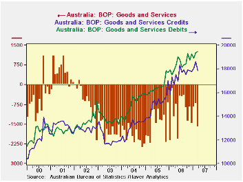
Australia's balance of trade in goods and services moved further into deficit in March as exports declined and imports continued increasing. The overall deficit was A$1,622 million, up from A$728 million in February (seasonally adjusted). The year-ago figure was A$1,241 million.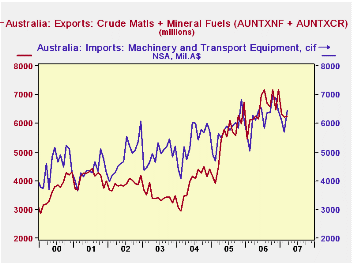
Australia is a mineral-rich economy. It exports substantial amounts of so-called "crude materials" and has extensive two-way trade in "mineral fuels", running a surplus in that category. (These are SITC commodity groups.) So Australia actually derives some benefit from recent rising oil and commodity prices. See in the table below, where we have added together the exports of these raw materials. They now basically pay for the country's biggest imports, machinery and transport equipment.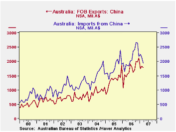
Another distinction the mineral resources bring to Australia's trade is the existence of a relatively moderate deficit in trade with China. In 2006, this was A$5.1 billion, or just A$425 million per month; the first three months this year have averaged A$324 million. While trade data by country and commodity are not available to us, it would seem that a good share of Australia raw materials would go to China, covering much of what we assume would be imports of consumer goods.
In contrast, the country runs a sizable deficit with the United States. Exports to the US totaled just over A$10 billion last year and averaged A$757 million the first three months this year. Imports, though, were A$24.5 billion in 2006 and averaged just under A$2 billion a month during Q1 this year. Australia also carries a noticeable deficit with Europe. We assume that the US and Europe are sources for a good portion of its machinery imports. In sharp contrast, Australia runs significant surpluses with Japan and Korea, again, we'd guess as a provider for some of their raw material needs.
| AUSTRALIA (Mil.A$) | Mar 2007 | Feb 2007 | Jan 2007 | Mar 2006 | Monthly Averages|||
|---|---|---|---|---|---|---|---|
| 2006 | 2005 | 2004 | |||||
| Balance on Goods & Services | -1,622 | -728 | -843 | -1,241 | -979 | -1,399 | -1,985 |
| Credits (Exports) | 17,839 | 18,632 | 18,066 | 16,650 | 17,454 | 15,078 | 13,103 |
| Debits (Imports) | 19,461 | 19,360 | 18,909 | 17,891 | 18,432 | 16,477 | 15,087 |
| Goods Balance: China (NSA) | -158 | -312 | -502 | -431 | -425 | -436 | -576 |
| USA (NSA) | -1,428 | -963 | -1,291 | -1,241 | -1,198 | -1,011 | -915 |
| Raw Material Exports* (NSA) | 6,250 | 6,226 | 6,318 | 6,136 | 6,533 | 5,475 | 3,908 |
| Machinery Imports (NSA) | 6,448 | 5,682 | 6,095 | 6,277 | 6,237 | 5,745 | 5,353 |

Robert Brusca
AuthorMore in Author Profile »Robert A. Brusca is Chief Economist of Fact and Opinion Economics, a consulting firm he founded in Manhattan. He has been an economist on Wall Street for over 25 years. He has visited central banking and large institutional clients in over 30 countries in his career as an economist. Mr. Brusca was a Divisional Research Chief at the Federal Reserve Bank of NY (Chief of the International Financial markets Division), a Fed Watcher at Irving Trust and Chief Economist at Nikko Securities International. He is widely quoted and appears in various media. Mr. Brusca holds an MA and Ph.D. in economics from Michigan State University and a BA in Economics from the University of Michigan. His research pursues his strong interests in non aligned policy economics as well as international economics. FAO Economics’ research targets investors to assist them in making better investment decisions in stocks, bonds and in a variety of international assets. The company does not manage money and has no conflicts in giving economic advice.
More Economy in Brief