Global| May 08 2007
NFIB: It’s Weak, No FIB
Summary
The chart of the main NFIB survey is a telling graphic on the state of the economy. While the index reached its local low in August of 2006 and there is a sort of bounce in train since then (dead-cat bounce?), the index remains [...]
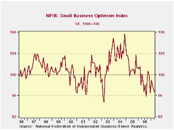
The chart of the main NFIB survey is a telling graphic on the state of the economy. While the index reached its local low in August of 2006 and there is a sort of bounce in train since then (dead-cat bounce?), the index remains ‘locked’ in the throes of a broad downtrend. This month’s slippage brings the index that much closer to breaking down the fragile up trend that is an artifact of the broader, more powerful, downtrend range and it asks legitimate questions about growth and the contribution of small business - the key driver of job growth.
We can peruse the details of the report for more clues as to what is weak and why. We present in the table below the net balance measures from the various questions in the NFIB surveys. The final column expresses each of these as a point in the range of values the measure had taken on since 1990. A high reading (say 100%) means the measure is at the top of its range of values for the period the lowest read is 0% and it would signify the weakest reading of the period.
A quick look at column five shows that most values are below 50%, implying that they are below the midpoint of their respective range of values since 1990.
As for recessions, the NFIB does not seem to be a good gauge of those since it did not trough in the last recession but rather in April of 2003 well into recovery.
The report has some interesting features about the economy apart from bearing witness on recession. It tells us that firms are raising prices to a greater than normal degree, net positive responses to the question are in the nearly the 70th percentile; this also seems to be reflected in wages in their 63rd percentile - also above average. Still, firms are increasing employment at an above average pace (57Th percentile) and reporting higher sales Q/Q, 57th percentile.
Firms are downbeat, however, on some key forward-looking aspects: they do not see easing credit conditions. They do not see the economy improving (21 percentile of that range!) and they are below average in seeing real sales rise 6-months out. Consequently firms are not planning capital improvements; those plans are in the bottom 25 percentile of their range.
By the way, I prefer this percent of range approach to the raw net balance figures because the net balance figures across responses have all different characteristics. The percentile measures let us see the position of response relative to past responses instead of Vs the zero or neutral reading. I find this more useful
Around the 50th percentile business conditions are not bad. And most NFIB responses are in the 40% to 60% range. But some are not, and those that are not, are weaker. Seeing bottom 25 percentile responses to the question ‘good time to expand?’ and “planning in capital spending over the next 3 to 6 months?” is not a sign of confidence. For now what we have is a still strong labor reading. And NFIB expectations could be wrong. Who is clairvoyant after all? But now these concerns will hold back expansions and only feed the hand to mouth demands. We have seen some improvement in capital spending plans by the firms that report to the durable goods report and maybe this trend will have some positive impact on independent businesses down the road.
For now this is a decidedly downbeat report on the economy.
| NFIB | % of range | ||||
| Apr-07 | Mar-07 | Feb-07 | Apr-06 | since 1990* | |
| INDEX | 96.8 | 97.3 | 98.2 | 98.9 | 33.1% |
| % saying…… | |||||
| Firms Expecting | |||||
| Credit conditions to ease | -7.0 | -8.0 | -8.0 | -7.0 | 46.2% |
| Econ to Improve | -8.0 | -7.0 | -2.0 | -1.0 | 21.3% |
| Higher real sales 6 Mo | 14.0 | 14.0 | 17.0 | 22.0 | 42.9% |
| Firms Reporting | |||||
| Higher Earnings | -19.0 | -15.0 | -19.0 | -21.0 | 46.4% |
| Inventories 'too low' | -3.0 | -5.0 | -2.0 | -2.0 | 36.4% |
| Good time 2 Expand | 12.0 | 12.0 | 18.0 | 17.0 | 26.1% |
| Firms Planning | |||||
| To Increase Employ | 13.0 | 12.0 | 13.0 | 17.0 | 57.1% |
| To Add Inventories | 3.0 | 3.0 | 3.0 | 2.0 | 40.0% |
| Capital expenditures 3-6 mo | 29.0 | 33.0 | 30.0 | 30.0 | 25.0% |
| Inflation Issues | |||||
| Firms raising | |||||
| Average selling prices | 18.0 | 15.0 | 13.0 | 12.0 | 69.4% |
| Worker Compensation | 26.0 | 28.0 | 30.0 | 26.0 | 63.6% |
| Firms plan to raise | |||||
| Average selling price | 24.0 | 22.0 | 23.0 | 24.0 | 59.1% |
| Worker Comp | 37.0 | 35.0 | 39.0 | 37.0 | 47.1% |
| Other | |||||
| Firms reporting | |||||
| Higher sales Q/Q | 4.0 | 0.0 | -1.0 | -3.0 | 57.5% |
| Credit harder to get | 5.0 | 7.0 | 5.0 | 5.0 | 46.2% |
| Raising inventories | -2.0 | 2.0 | 5.0 | 1.0 | 40.9% |
| *100% is high, 0% is low | |||||
by Robert Brusca May 8, 2007
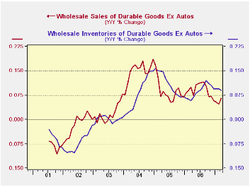
Inventories are tricky to analyze. We plot durables excluding autos and nondurables excluding oil to get at the trends outside these two sectors. When we do we find inventory and sales growth are coming into better balance.
Durables inventory growth still exceeds sales growth; inventory and sales growth trends have come together for nondurables.
The two charts show the evolution of the trends on relatively smooth year-over-year percent changes but the table below shows more time horizons.
Here we see that sales growth has surpassed inventory growth for durables and nondurables over three months and six months when oil and autos are excluded, respectively. Indeed, most categories show that sales growth has overtaken inventory growth and I:S ratios are receding. Still, at the far right we show where I:S ratios stand relative to their range of values since 1998; we see that most sectors have ratios that are still high in their range. So although sales are starting to grow faster than inventories, inventories are still plentiful relative to the pace of sales according to historic standards (last nine years).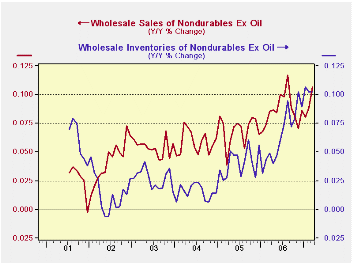
This is an encouraging sign that inventory liquidation is not called for. Firms do not even need to slow the pace of inventory accumulation since sales growth exceeds inventory growth. But sales are not yet that much stronger than inventories across the board for wholesalers. Petroleum, autos and computers are still building stocks faster than they are growing sales in the recent three months. And, since stocks generally are still high relative to sales this report is no clarion call for inventory rebuilding. That is still a ways off.
This report is more notable for its lack of bad news than for the presence of good news.
| All growth rates annualized | Inventory-&-Sales Trends: Wholesalers | I:S ratio Percent of |
|||||
| 2007 Mar | 3-mos | 6-mos | 12-mos | Range | |||
| Sales | Inventories | Sales | Inventories | Sales | Inventories | 1998-date | |
| All Wholesaling | 7.7% | 5.3% | 7.7% | 4.6% | 8.4% | 8.1% | 7.0% |
| Durables | 3.3% | 3.3% | 5.1% | 2.4% | 6.6% | 7.6% | 18.3% |
| Durables less autos | 7.9% | 3.8% | 4.2% | 3.5% | 6.6% | 9.0% | 25.2% |
| Autos | -16.3% | 0.6% | 9.8% | -3.3% | 6.8% | 0.7% | 7.0% |
| Computers | 2.3% | 4.8% | 10.8% | 1.7% | 10.9% | 6.0% | 0.9% |
| Machinery | 16.6% | 5.6% | 6.1% | 5.2% | 8.1% | 9.1% | 28.7% |
| Other Durables | 6.4% | 2.9% | 2.6% | 2.9% | 5.5% | 9.2% | 28.7% |
| Nondurables | 12.1% | 9.0% | 10.2% | 8.6% | 10.1% | 9.0% | 5.2% |
| Nondurables less Petrol | 17.5% | 9.7% | 10.6% | 10.5% | 10.7% | 10.2% | 6.1% |
| Petroleum | -5.9% | 1.8% | 8.6% | -9.4% | 8.0% | -2.8% | 44.3% |
| Groceries | 28.9% | 27.2% | 18.3% | 18.0% | 14.8% | 16.9% | 57.4% |
| Other Nondurables | 13.0% | 5.7% | 7.6% | 8.7% | 9.0% | 8.7% | 7.8% |
| Percentage of range Low Percent reflect high standing (ie top 1% or bottom 99th percentile) | |||||||
by Robert Brusca May 8, 2007
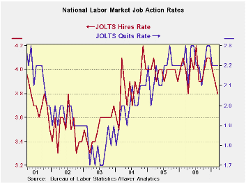
JOLTS data for the Quit rate, a very good directions signal for the job market, show that quit rates have been drifting lower. A lower quit rate is a sign of less confidence in a worker’s ability (or perceived ability) to get a job. The table below shows that quit rates in the West and the Midwest are still pretty high in their respective ranges. In the South they are still in the top 30% showing a lingering confidence that people can quit their jobs and find a new one. But in the Northeast quit rates are scraping the bottom, in the lower 16 percentile of their range and are well below average.
Nationally the quit rate is a bit lower but not very far off peak. Mostly it is steady at what has been a persisting high level for the quit rate since early 2006. But the hire rate has fallen more noticeably (See chart above). And while we know that the economy has matured and labor force growth has slowed the drop in the hire rate seems to be more than what demographics might thrust upon us. It is a disturbing sign.
Next we look at JOLTS data arrayed by industry. These data do not exist in the data base but have been constructed using weights to create a services sector. The other sectors are based on primary JOLTS data and sector definitions. I always like to create a services sector since goods and services sectors have such different forces putting pressure on them. Of course, construction is also quite different, these days. We don’t want the manufacturing/nonmanufacturing breakdown to bury that, as the ISM currently is doing. And government is, well, government. It is the alpha–omega sector. It’s where you go to get your first job when you are inexperienced and where you go to take a prestige job when you’ve ‘retired’ (Paulson).
These sectors show that Manufacturing and Services still sport firm levels of openings in terms of their percentile readings. Openings are in the top 25% of their respective ranges or better. Yet services and manufacturing have seen slippages recently (see raw readings in the bottom of the table). Quits are still quite strong and the quit rates have not showed much erosion for Manufacturing or Services. Hires are no longer strong in any sector. Oddly, it shows some improvement in Construction. Hires are still best (in the 57th percentile) for services and near the one-third mark or so in other sectors – clearly sub-par outside of services.
Seeing hires gain for construction is odd especially with the weakest quit rate it has seen since 2000. The government sector has a lot of openings VS moderate percentiles for hires and quits.
These data speak of slippage in the labor market. Despite the fact that the two key sectors, Manufacturing and Services, are still emitting firm readings in absolute terms, they are nonetheless slipping. Combined with other reports, such as the NFIB survey, these readings underscore that weakness seems to be spreading. What it does not tell us is if the odd early Easter and disruptive weather is responsible for it or not. But things -‘things’- are undeniably looking weaker.
One very interesting things about JOLTS is that we can get a geographical cut at the data and an industry cut as well. It is a very useful report for that reason. It shows US that the Northeast is sagging the most but hires are still weakening across the board with the exception of the West. As such, this report confirms themes we have seen in other reports.
It confirms that:
That services sector is the strongest sector.
That the services sector is showing some weakening
That things are weaker out East and stronger in the West.
While we still struggle for better quantitative assessments and to understand the causes, these general observations hold true.
| Since Sep-02 | Northeast | South | Midwest | West | |
| Quit | Quit | Quit | Quit | average | |
| Mar-07 | 1.3 | 2.3 | 1.9 | 2.1 | 1.9 |
| Feb-07 | 1.3 | 2.3 | 1.9 | 2.0 | 1.9 |
| Jan-07 | 1.4 | 2.2 | 1.9 | 2.0 | 1.9 |
| Max | 1.8 | 2.5 | 2.0 | 2.2 | 2.0 |
| Average | 1.4 | 2.1 | 1.7 | 1.9 | 1.8 |
| Min | 1.2 | 1.8 | 1.4 | 1.4 | 1.5 |
| Range | 0.6 | 0.7 | 0.6 | 0.8 | 0.6 |
| %-Tile | 16.7% | 71.4% | 83.3% | 87.5% | 77.3% |
| % AVG | 93.1% | 109.4% | 112.8% | 111.8% | 107.3% |
| Min date | Feb-04* | Sep-03* | Dec-03* | Dec-03* | -- |
| *Last Occurrence | |||||
| Major Job Sectors | ||||
| Mar-07 | Services | MFG | Constructions | Government |
| Job Openings | 79.6% | 76.9% | 47.6% | 87.5% |
| Hires | 57.3% | 33.3% | 30.0% | 40.0% |
| Separations | 64.2% | 66.7% | 8.0% | 25.0% |
| Quits | 82.3% | 100.0% | 0.0% | 50.0% |
| Raw readings by Industry | ||||
| OPENINGS | Services | MFG | Constructions | Government |
| Mar-07 | 2.3 | 2.2 | 1.8 | 2.1 |
| Feb-07 | 2.6 | 2.3 | 2.9 | 2.1 |
| Jan-07 | 2.6 | 2.3 | 1.8 | 2.1 |
| Dec-06 | 2.7 | 2.5 | 1.4 | 2.1 |
| HIRES | Services | MFG | Constructions | Government |
| Mar-07 | 4.3 | 2.3 | 4.8 | 1.5 |
| Feb-07 | 4.5 | 2.6 | 3.9 | 1.7 |
| Jan-07 | 4.5 | 2.6 | 3.9 | 1.7 |
| Dec-06 | 4.5 | 2.7 | 4.4 | 1.7 |
| SEPARATIONS | Services | MFG | Constructions | Government |
| Mar-07 | 4.1 | 2.8 | 4.3 | 1.2 |
| Feb-07 | 4.0 | 3.0 | 4.2 | 1.3 |
| Jan-07 | 4.0 | 2.8 | 5.2 | 1.4 |
| Dec-06 | 4.1 | 2.6 | 5.0 | 1.3 |
| QUITS | Services | MFG | Constructions | Government |
| Mar-07 | 2.5 | 1.6 | 1.5 | 0.6 |
| Feb-07 | 2.6 | 1.5 | 1.6 | 0.6 |
| Jan-07 | 2.5 | 1.6 | 1.8 | 0.7 |
| Since 2000 | ||||
by Louise Curley May 8, 2007
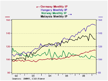
March industrial production data for the countries in the various Haver data bases are becoming available. Today industrial production data for Germany (GERMANY), Norway (NORDIC), Hungary (EMERGECW) and Malaysia (EMERGEPR) were released. Industrial production indexes measure the trend of production not the magnitude of production. As a measure of the relative sizes of the various economies, the dollar value of GDP of each country valued at current prices and exchange rates is good indicator. In 2006 the German GDP was equal to $2,900 billion; Norway, $335 billion; Hungary, $112 billion and Malaysia, $149 billion.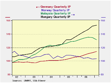
All four countries experienced a decline from February, 1.5% for Norway, 0.6% for Hungary, 0.4% for Malaysia, and 0.1% for Germany. The monthly data for the four countries are plotted in the first chart. A clearer picture of the trends in production emerges when we use quarterly data as shown in the second chart.
Production in the two emerging economies--Hungary and Malaysia--has grown much faster since 2002 than in the two developed economies--Norway and Germany. Recent trends, however, show that growth in Malaysia's industrial production has begun to taper off and has fallen behind that of Hungary. In the first quarter, as production declined in Malaysia, the gap has widened.
A similar divergence in the growth of production has occurred in the developed economies of Germany and Norway. Except for a brief period in 2002, industrial production in Norway has not as yet reached its 2000 average and, in the first quarter of this year, was roughly 6% below the 2000 average. Meanwhile, the trend in industrial production in Germany, which remained relatively flat until early 2005, has turned up and in the first quarter was 14% above the 2000 average.
| INDUSTRIAL PRODUCTION (2000=100) | Mar 07 | Feb 07 | Mar 06 | M/M % | Y/Y % | 2006 | 2005 | 2004 |
|---|---|---|---|---|---|---|---|---|
| Malaysia | 130.8 | 131.3 | 134.7 | -0.38 | -2.90 | 134.0 | 127.5 | 122.5 |
| Hungary | 152.38 | 153.3 | 142.20 | -0.60 | 7.16 | 145.48 | 131.06 | 122.07 |
| Norway | 92.6 | 94.0 | 96.3 | -1.54 | -3.84 | 94.6 | 97.0 | 97.3 |
| Germany | 114.4 | 114.5 | 106.2 | -0.07 | 7.72 | 109.8 | 103.7 | 100.8 |
| Q1 07 | Q4 06 | Q1 06 | Q/Q % | Y/Y % | 2006 | 2005 | 2004 | |
| Malaysia | 131.9 | 135.0 | 131.7 | -2.27 | 0.13 | 134.0 | 127.5 | 122.5 |
| Hungary | 153.13 | 152.03 | 139.57 | 0.72 | 9.72 | 145.48 | 131.06 | 122.07 |
| Norway | 93.6 | 92.9 | 96.3 | 0.71 | -2.81 | 94.6 | 97.0 | 97.3 |
| Germany | 114.3 | 112.4 | 106.5 | 1.72 | 7.32 | 109.8 | 103.7 | 100.8 |

Robert Brusca
AuthorMore in Author Profile »Robert A. Brusca is Chief Economist of Fact and Opinion Economics, a consulting firm he founded in Manhattan. He has been an economist on Wall Street for over 25 years. He has visited central banking and large institutional clients in over 30 countries in his career as an economist. Mr. Brusca was a Divisional Research Chief at the Federal Reserve Bank of NY (Chief of the International Financial markets Division), a Fed Watcher at Irving Trust and Chief Economist at Nikko Securities International. He is widely quoted and appears in various media. Mr. Brusca holds an MA and Ph.D. in economics from Michigan State University and a BA in Economics from the University of Michigan. His research pursues his strong interests in non aligned policy economics as well as international economics. FAO Economics’ research targets investors to assist them in making better investment decisions in stocks, bonds and in a variety of international assets. The company does not manage money and has no conflicts in giving economic advice.
More Economy in Brief