Global| Jun 28 2007
"I'm Going To Buy That House Whether I Can Afford It or Not!" "And I'm Going To Lend You the Money!"
Summary
The quip in our title isn't universally applicable, but it does describe some housing market behavior in the last few years. On Monday, our colleague Bob Brusca brought us up to date on existing home sales; he interpreted these data [...]
The quip in our title isn't universally applicable, but it does describe some housing market behavior in the last few years. On Monday, our colleague Bob Brusca brought us up to date on existing home sales; he interpreted these data from the National Association of Realtors (NAR) as showing "diminishing" weakness through May. Today, NAR published some details on its housing affordability indexes, and it is evident that an improvement in the affordability situation is giving some support to sales volumes.
However, we also see that the relationship between sales and affordability has largely broken down since early 2004. Buyers, sellers and financiers appeared to be in some denial as financing costs were rising from that time to the middle of last year. We can see this in the nation as a whole and in a couple of regions in particular.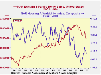
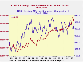
"Housing affordability" is calculated from home prices, mortgage rates and incomes. NAR analysts calculate the mortgage payment on a home at the median price financed by an average mortgage rate with a 20% down payment. Assuming the mortgage payment is 25% of household income, they can derive the "qualifying income" associated with the prevailing market conditions. The affordability index is the ratio of actual median income to the calculated qualifying income. Ordinarily, one would expect affordability and sales volume to be positively correlated: more affordability should support more sales and less affordability should be associated with fewer sales. In the first graph this is plainly the case, with a 63% correlation ratio from 1989 through 2003. But in the second graph, the 14-plus-year span from 1993 through the latest month carries a -44% ratio. People kept buying -- and lenders kept lending -- long after affordability had begun to fall sharply.
This is especially the case in the West. See in the third graph that "affordability" over the more recent time span has a whopping 75% negative relationship with sales. Affordability was already much lower there than in other areas, as seen in the table below. It shows that homes are most affordable in the Midwest and least in the West. Affordability is just about in equilibrium (that is, near 100) in the Northeast, which we find a bit surprising. This says incomes and home prices are fairly well balanced in this region, while the West faces substantially over-priced housing relative to incomes. The median household devotes a major fraction of its income to housing expense.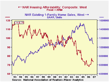
What did happen in 2004 to break up the relation of sales to so-called affordability? We show this in the fourth graph: home prices were continuing to climb, but prior to 2004, interest rates were declining enough so that the monthly payment was fairly steady as a percentage of income, hovering around 20%. All it took for affordability to start to suffer was for interest rates to stop falling. Even before they began to rise in earnest in mid-2005, affordability was dropping. It continued to decline until prices leveled out in mid-2006 and only began to recover when both mortgage rates and home prices were easing. [In the graph, we have indexed the price series to 2000=100, so it will fit nicely on the graph with an affordability index and an interest rate. Indexing is a simple-to-apply function in the DLXVG3 software.]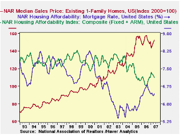
All these data are in Haver's REALTOR database, information we get from the National Association of Realtors, which also contains other detail and a national calculation of affordability for first-time homebuyers. A few summary series are contained in USECON.
| Housing Affordability Indexes | May 2007 | Apr 2007 | Mar 2007 | May 2006 | 2006 | 2005 | 2004 |
|---|---|---|---|---|---|---|---|
| Total US | 109.9 | 112.4 | 113.3 | 101.8 | 106.1 | 111.8 | 123.9 |
| Northeast | 96.7 | 94.1 | 99.7 | 91.8 | 95.5 | 99.1 | 108.7 |
| Midwest | 149.1 | 156.0 | 157.3 | 140.1 | 145.5 | 150.2 | 167.5 |
| South | 120.6 | 124.7 | 124.0 | 109.9 | 115.7 | 121.9 | 129.9 |
| West | 73.6 | 73.6 | 75.1 | 69.3 | 70.4 | 76.0 | 88.3 |
Carol Stone, CBE
AuthorMore in Author Profile »Carol Stone, CBE came to Haver Analytics in 2003 following more than 35 years as a financial market economist at major Wall Street financial institutions, most especially Merrill Lynch and Nomura Securities. She had broad experience in analysis and forecasting of flow-of-funds accounts, the federal budget and Federal Reserve operations. At Nomura Securities, among other duties, she developed various indicator forecasting tools and edited a daily global publication produced in London and New York for readers in Tokyo. At Haver Analytics, Carol was a member of the Research Department, aiding database managers with research and documentation efforts, as well as posting commentary on select economic reports. In addition, she conducted Ways-of-the-World, a blog on economic issues for an Episcopal-Church-affiliated website, The Geranium Farm. During her career, Carol served as an officer of the Money Marketeers and the Downtown Economists Club. She had a PhD from NYU's Stern School of Business. She lived in Brooklyn, New York, and had a weekend home on Long Island.
More Economy in Brief