Global| Feb 21 2014
How Healthy Is the Euro Area?
Summary
The euro area is making an economic recovery but ones may wonder whether it will last. Economic growth has begun to progress even in countries that had been reporting GDP declines. However, economic cycles come and go and not all of [...]
 The euro area is making an economic recovery but ones may wonder whether it will last. Economic growth has begun to progress even in countries that had been reporting GDP declines. However, economic cycles come and go and not all of them contain phases that are reasonably sustainable. In the case of Europe and the European Monetary Union (EMU), we wonder if the proper foundation is there that can allow growth to continue to emerge and blossom.
We have recently seen Greece post a larger trade deficit, but to pair it with a current account surplus based on an increase in tourism. While that represents some progress for Greece, it does not represent an improvement in competitiveness. Today, Spain has posted trade figures that represent some substantial progress in competitiveness. Yet Spain's progress is difficult to completely pin down. It may be that Spain is achieving more progress versus countries outside of the euro area than within the euro area.
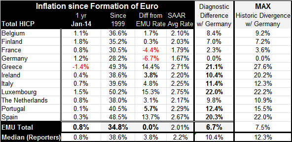
For evidence of progress we turn table entitled "Inflation since Formation of Euro".
This table includes the original EMU members (CAVEAT: only members that have reported HICP data thorough January 2014) of the EMU plus the first addition, Greece. This simple table points out some of the foibles of the euro construction as well as some of the challenges that are faced in trying to get euro area-wide growth in gear.
In the table, the column labeled January 2014 (one year) shows the inflation performance over the last 12 months. The column to the right of it shows the aggregate increase in the various inflation measures (the total HICP) since the euro area was formed (column `since 1999'). A quick perusal of this column shows that Germany has the smallest aggregate increase in the price level since the EMU was formed with France in second place. The fourth column that is entitled `average rate' (SAAR) derives the average annual rate compounded rate of inflation from the second column. In this column, you can see that at the bottom the European Central Bank rate is 2.01% implying that the ECB has been good on its pledge to keep inflation at 2%.
However, there is a fly in the ointment. Column three shows the divergence of the aggregate price increases by country from the increase in the euro area as a whole. Entitled "Differences from EMU Rate" column three finds only two nations that have rates of inflation below that of EMU as a whole. The fifth column uses Germany as a base by which to compare other nations' progress, because Germany has persistently had the lowest increase in the price level in the euro area.
In looking at the differences between the country price level rises in the rise in the monetary union as a whole, it is striking that of the 11 countries in the table only two have aggregate rise in the price level less than the increase in EMU as a whole. Because the target that the ECB shoots at is a weighted average the preponderance of EMU members have inflation overshoots!
Germany and France are the two largest economies in the euro area and they also have the smallest rise in their respective aggregate price levels. That means that every other country in the euro area has experienced more inflation than these two. The rest of EMU has had more inflation than the target that is been set for the euro area as a whole. Note that Germany's average inflation rate has been 1.67%. France's rate has been 1.79%. Close to them is Finland 2.03% and Belgium at 2.1% were looking past them we find inflation rates at 2.2% (Ireland and Italy) up to a 2.7% (Greece and Spain) and we have to Luxembourg at 2.75%. Compound these differences since 1999 and you get the large gaps you see in column three. The difference between each countries and the low inflation rate country (Germany) is memorialized in the fourth column (second from the right).
In the final column on the right-hand side is calculated as the maximum historic divergence between each country and Germany. In comparing the two columns you can begin to get an idea of the progress that has been made (or not) as austerity has kicked in. Understandably comparing consumer prices is not exactly right when you are strictly speaking of competitiveness. We should be looking at producer prices; but producer prices are much more varied because of their different local mixes of goods across countries. Instead we will use the HICP which is a harmonized index to be indicative, if not decisive.
Perhaps the first flaw we see in this application is from Spain which is producing only a small improvement in its recent rate result with inflation Germany compared with its peak gap. The current gap has only been narrowed by less than two percentage points from its peak. Has Spain really made more progress than that? Or have other special circumstances come into play in evaluating the performance of Spanish trade?
Also making very little progress is Finland's divergence; its peak 7.2% divergence is a stone's throw from its current 7% gap. Italy's maximum divergence has been 12.3%; despite ongoing low inflation, its current divergence is only down to 11.4%, an improvement but a small one. The Netherlands also is only improved to 9 .8% from its maximum of 10.9%. Luxembourg also shows very tiny improvement coupled with substantial and now maximum divergence with Germany (it is not at a historic maximum but at a cross-sectional maximum at the current time among reporting fellow original EMU members). Still, Luxembourg is a very different situation. It is not a manufacturing center; it is a small country specializing in the financial sector in the administration of trust accounts.
Making much more substantial progress has been Greece as its historic maximum divergence with Germany at 27.6%, has been reduced to 21.1%. Ireland has made significant progress reducing its divergence Germany from a maximum of 20.2% to 10.4% currently. Portugal has brought its divergence down to 12.4% from 15.5%.
Looking at the year-over-year figures in the first column, we see the lowest inflation increase in the HICP is a drop of 1.4% over the last 12 months in Greece. Portugal with an increase of 0.1% is next. Spain has only a net increase of 0.3% and Ireland shows a net increase of only 0.4%. These markers now have lower 12-month inflation than Germany, the usual low inflation country. In fact Germany's 12-month inflation rate at 1.2% is the third highest over the last year, trailing only Finland at 1.8% and Luxembourg at 1.5%. In this we can see that there has been some tendency for both ends of the spectrum to make adjustments. Germany, the usual low inflation country, has migrated toward the top of the list, while Greece, Ireland, Portugal and Spain -historically high inflation countries- have migrated toward the bottom of the list.
However the table shows us that significant differences remain; some countries have done a better job in closing the gap than have others. Spain's recent trade performance is a cautioning note that HICP comparisons may not contain all the appropriate ingredients when we assess competitiveness. However, the table goes a long way to showing us where progress is being made, with the degree of progress is, in which countries are mainly making progress. These are very helpful things to know.
Still, the ongoing divergence in the rise in the price level since the formation of the euro area implies that competitiveness conditions have shifted remarkably within the euro area among the countries sharing the single currency since the euro area's formation. The fact that only two countries in the euro area sport aggregate price level increases that are less than the one reported for the euro area overall, underscores that measures attributed to the euro area may not be reflective of conditions in individual member countries. This also means that ECB policy made on the basis of the aggregate measures may not be appropriate for a number of its members.

Robert Brusca
AuthorMore in Author Profile »Robert A. Brusca is Chief Economist of Fact and Opinion Economics, a consulting firm he founded in Manhattan. He has been an economist on Wall Street for over 25 years. He has visited central banking and large institutional clients in over 30 countries in his career as an economist. Mr. Brusca was a Divisional Research Chief at the Federal Reserve Bank of NY (Chief of the International Financial markets Division), a Fed Watcher at Irving Trust and Chief Economist at Nikko Securities International. He is widely quoted and appears in various media. Mr. Brusca holds an MA and Ph.D. in economics from Michigan State University and a BA in Economics from the University of Michigan. His research pursues his strong interests in non aligned policy economics as well as international economics. FAO Economics’ research targets investors to assist them in making better investment decisions in stocks, bonds and in a variety of international assets. The company does not manage money and has no conflicts in giving economic advice.
More Economy in Brief