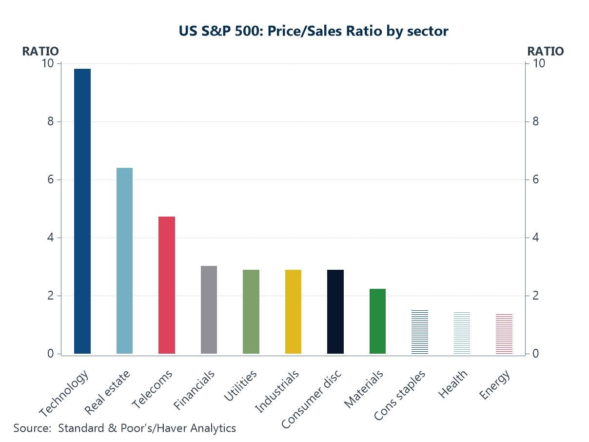
Financial markets have been caught between conflicting crosscurrents in recent days. On the one hand, risk sentiment has been weighed down by mounting concerns over US lenders and broader credit conditions, renewed tariff worries, the ongoing government shutdown, and growing unease about a potential AI-driven valuation bubble (chart 1). On the other, expectations have strengthened that major central banks will continue to ease policy in the face of softer growth and moderating inflation, fueling hopes of a soft landing (chart 2). Supporting that view, oil prices have declined off easing geopolitical tensions in the Middle East (chart 3), and China’s credit impulse—together with stronger-than-expected GDP—has provided a quiet but important lift to global growth momentum (chart 4), even if property market weakness persists. US wage growth also continues to cool according to some private sector surveys (chart 5), helping to ease inflation concerns, while in the UK, softer headline inflation has been welcomed, though sticky services CPI and rising producer prices have tempered the good news (chart 6). Taken together, the macro narrative is one of lingering risks offset by moderating inflation pressures and easing hopes—an uneasy equilibrium that has left financial markets more volatile but still resilient.
Introducing
Andrew Cates
in:Our Authors
Andy Cates joined Haver Analytics as a Senior Economist in 2020. Andy has more than 25 years of experience forecasting the global economic outlook and in assessing the implications for policy settings and financial markets. He has held various senior positions in London in a number of Investment Banks including as Head of Developed Markets Economics at Nomura and as Chief Eurozone Economist at RBS. These followed a spell of 21 years as Senior International Economist at UBS, 5 of which were spent in Singapore. Prior to his time in financial services Andy was a UK economist at HM Treasury in London holding positions in the domestic forecasting and macroeconomic modelling units. He has a BA in Economics from the University of York and an MSc in Economics and Econometrics from the University of Southampton.

Publications by Andrew Cates
 Global| Oct 16 2025
Charts of the Week: Momentum With Caveats
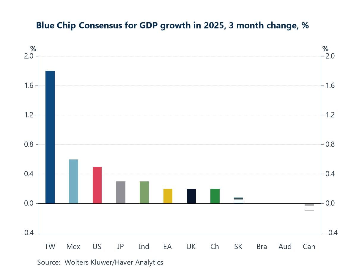
Global financial markets are entering mid-October with a cautiously optimistic tone, supported by a mix of better macro data and easing geopolitical risk. This week’s latest IMF forecasts nudged global growth expectations higher for 2025, broadly in line with indication from the latest Blue Chip consensus, where revisions have been led by economies tied to the tech and semiconductor cycle (chart 1). That same dynamic is evident in the US, where surging AI-driven data-center investment has emerged as an unexpectedly powerful growth driver (chart 2). Still, the timing of AI’s broader payoff remains uncertain—forecasters see labor-market disruption coming before a measurable productivity boost, underscoring an important macro risk if investment runs ahead of realized gains (chart 3). On the geopolitical front, the announcement of peace in Gaza this week has also pushed global oil prices down, providing a welcome disinflationary impulse (chart 4). At the same time, US–China trade tensions remain troubling. China’s export growth in September was stronger than expected but with gains concentrated in ASEAN and the EU, while shipments to the US continue to contract (chart 5). Meanwhile, in the UK, signs of a loosening labor market have added to expectations that the Bank of England could deliver further rate cuts in the months ahead (chart 6). Against this backdrop—buoyed by AI optimism but clouded by policy uncertainty around the US government shutdown, US–China frictions, and execution risks on technology—the global outlook has brightened modestly, but remains finely balanced.
by:Andrew Cates
|in:Economy in Brief
 Global| Oct 09 2025
Charts of the Week: Shutdowns and Shake-Ups
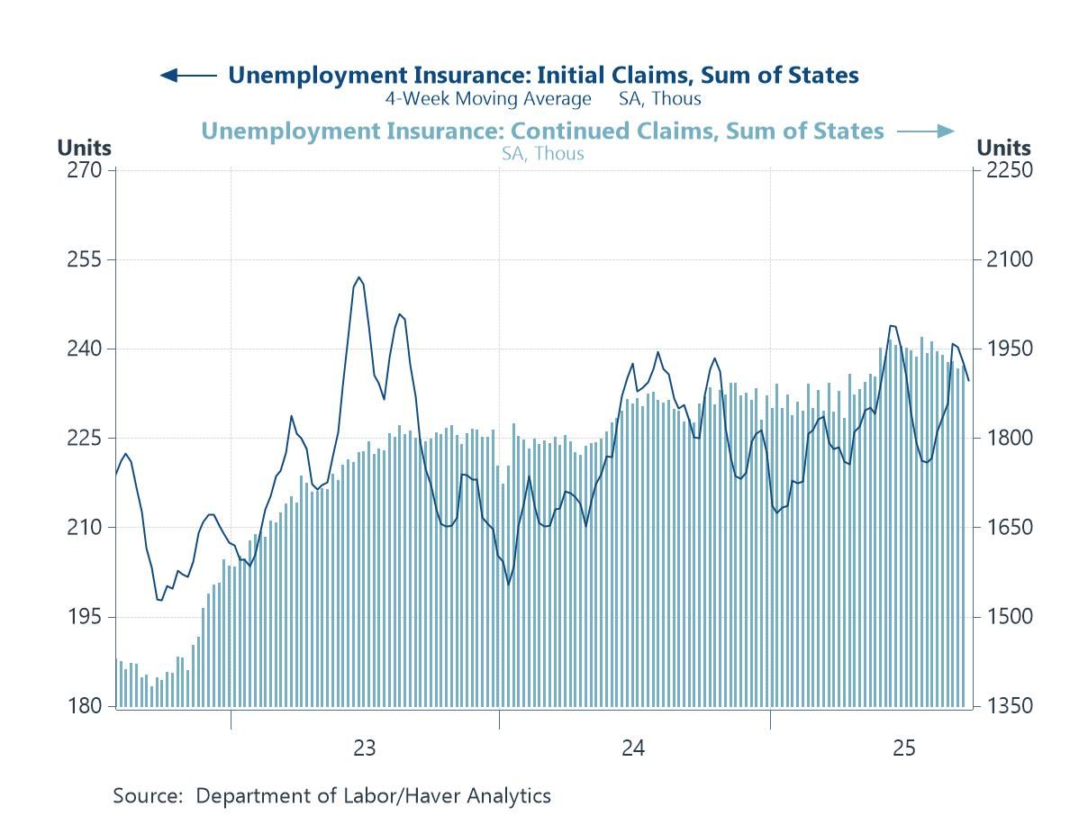
Financial markets have been navigating a US government shutdown that has frozen key data releases and muddied the macro picture, while political cross-currents in Europe and Asia have added to the noise—France has seen yet another prime minister resign, while Japan’s leadership change is being read as a tilt toward easier fiscal policy. With official US data dark, investors are leaning on proxies—such as Haver’s state-sum jobless-claims series—to keep tabs on labour market momentum (chart 1). From there, our remaining charts this week point to an uneven global macroeconomic story: US labour productivity has remained well ahead of peers, a lead that maps closely to cheaper electricity—where power costs are low, capex and margins hold up; where they’re high, manufacturing strains and measured productivity sag (charts 2 and 3). Yet produced capital continues to climb even as natural capital per capita erodes, helping to keep real energy costs sticky and weighing on the world’s productivity fabric (chart 4). In markets, Japanese equities have surged on policy-support hopes even as yen softness lingers (chart 5), and in emerging Asia, Vietnam’s Q3 GDP shows re-acceleration and firming domestic demand, though exposure to evolving US tariff policies is keeping the export outlook uncertain (chart 6). Net-net: growth pockets persist, but high real energy costs, policy shifts, and patchy visibility argue for a choppy, bifurcated path ahead.
by:Andrew Cates
|in:Economy in Brief
 Global| Oct 02 2025
Charts of the Week: Signals, Surprises and Shifts
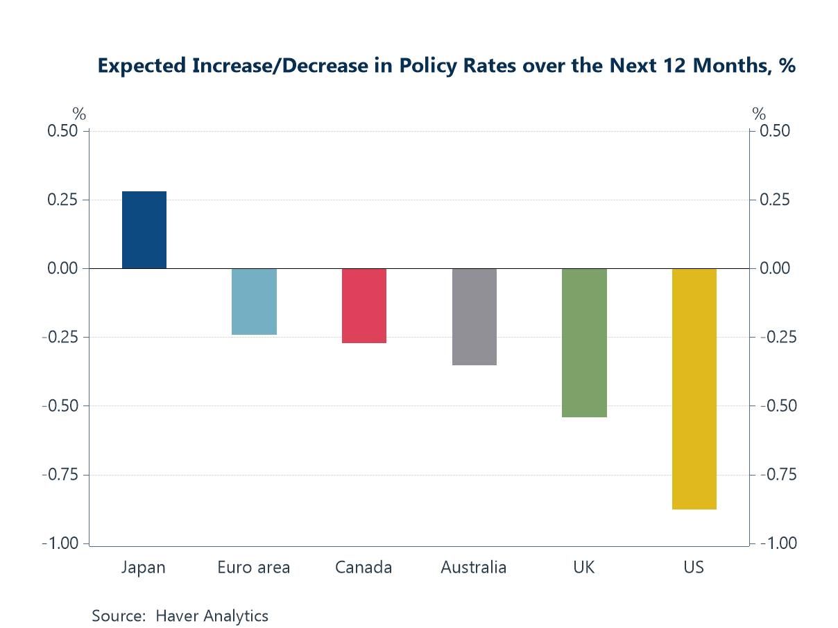
Global financial markets have remained resilient in recent days, supported by a combination of easing inflation concerns, steady growth data, and hopes that geopolitical risks may ease following news of a potential Israel–Gaza peace plan. At the same time, investors are watching closely for signs of a US government shutdown, which could delay the release of key economic indicators, including Friday’s nonfarm payrolls report. Against this backdrop, the charts this week highlight a set of themes shaping the outlook. Policy rate expectations have shifted little, with markets still pricing in further cuts across most major economies over the next 12 months, with Japan the notable outlier (chart 1). In the meantime, optimism surrounding AI’s productivity potential continues to drive market sentiment, and while hard evidence in the data remains limited, there are tentative signs of improvement—global growth surprises have been positive (chart 2), US productivity and business formation are showing some improvement (charts 3 and 4), and semiconductor trade is rebounding as AI-related demand rises (chart 5). Yet caution is warranted: formal productivity measures may still reflect post-COVID cyclical effects, and the upswing in military spending underscores how geopolitical instability is also driving global investment trends, tempering the more upbeat AI narrative (chart 6).
by:Andrew Cates
|in:Economy in Brief
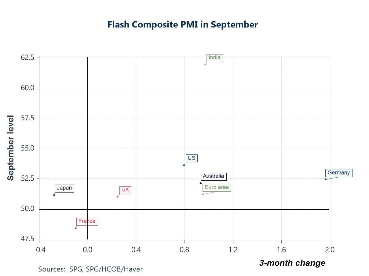 Global| Sep 25 2025
Charts of the Week: Resilient Activity, Noisy Policy
Global financial markets have remained steady over the past few days: equity volatility remains low, credit spreads remain contained and core yields have drifted rather than lurched, even as policy noise—especially around US trade—remains high. Against that backdrop, this week’s flash PMIs describe a resilient but uneven expansion: Germany has inched back into growth, while France has slipped further into contraction, a divergence echoed in bonds where the OAT–Bund spread has widened amid political and fiscal uncertainty (charts 1 and 2). Latest trade data from South Korea reinforce the idea of a tech-led floor under global activity, with semiconductor exports still advancing even as broader shipments remain choppy (chart 3). Labour demand indicators tell a similar story of moderation without fracture: high frequency data for job-postings have flattened in the US and UK and have turned up in Germany (chart 4). Stepping back, the latest US flow-of-funds report show a financing mix still anchored by heavy public borrowing absorbed by foreign investors but offset by a sizeable private-sector surplus—one reason perhaps for why the world economy has remained resilient despite persistent policy uncertainty (charts 5 and 6).
by:Andrew Cates
|in:Economy in Brief
- Global| Sep 22 2025
AI, Baumol, and the Healthcare Hump
The AI boom has revived the old promise that a wave of general-purpose technology will lift labour productivity everywhere. But sector mix matters. The chart below shows where recent job growth has actually happened: healthcare and social care. Since end-2023, employment in that sector has grown 3–4x faster than overall payrolls in the US, UK and Japan, pushing healthcare’s share of total jobs toward 14–15%. The euro area has been softer, but the direction is similar. Ageing populations and long-COVID backlogs are doing the heavy lifting. But the composition effect is awkward for macro optimists: healthcare is labour-intensive, highly regulated and only partly tradable—characteristics that usually come with lower measured productivity growth.
by:Andrew Cates
|in:Viewpoints
 Global| Sep 18 2025
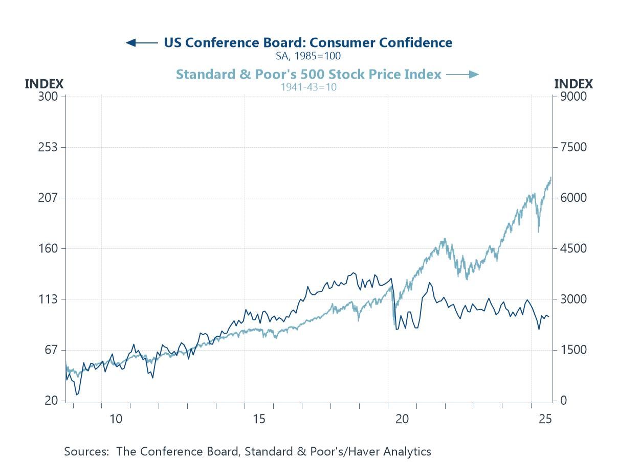
Charts of the Week: Faith in the Fed, Faith in Fiber
Global equity markets have remained near record highs over the past few days following the Fed’s 25bp cut on Wednesday, and which investors have seen as a key prop even without a full dovish pivot. AI optimism is also arguably doing some heavy lifting: markets are pricing a step-change in economy-wide productivity and margins from AI adoption, lifting multiples—especially among AI-exposed companies. However, some of this week’s charts frame the hurdles those hopes must clear: US consumer confidence remains subdued even as equities rise (chart 1); the Fed’s forward path is potentially becoming more politicised and inflation expectations have not softened in line with oil (chart 2); economists’ 2025 profit growth forecasts, in the meantime, have been marked lower and dispersion is wide, leaving valuations reliant on an AI-led earnings re-acceleration (chart 3). Elsewhere in Asia, earlier and ongoing easing underscores weak domestic demand and tariff risks rather than robust momentum (chart 4). Commodity dynamics could help at the margin—food prices have eased on better harvests and smoother supply chains (chart 5). Finally, and ahead of this week’s BoE decision in the UK, elevated services inflation tied to still-lofty pay growth is complicating the scope for further policy easing. In sum, the equity narrative arguably leans heavily on AI delivering tangible, near-term earnings power while policy remains credible and inflation contained; disappointment on any front in other words could challenge today’s valuations.
by:Andrew Cates
|in:Economy in Brief
 Global| Sep 11 2025
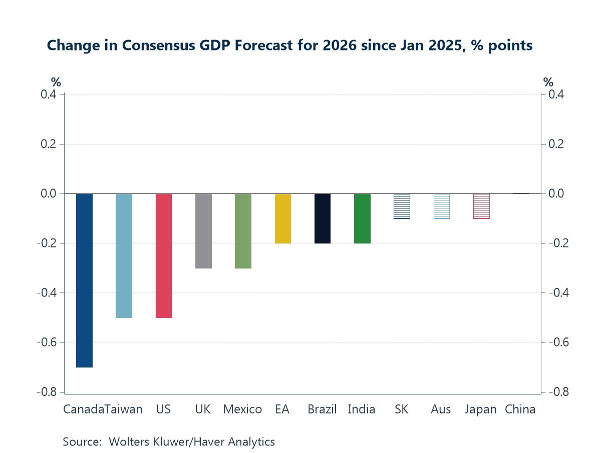
Charts of the Week: Labouring the Point
Financial markets have spent the week recalibrating after last Friday’s much weaker-than-expected US payrolls data: government bond yields have declined sharply, while equity markets have remained perky off hopes of a gentler policy path and still-resilient earnings. Even so, the medium-term growth lens has dimmed—since January, consensus GDP forecasts for 2026 have been marked down across most major economies, reflecting a tougher trade regime and geopolitical frictions (chart 1). Turning to the data, the BLS’s preliminary payroll benchmark revision shaved 911k jobs from US employment from April 2024 to March 2025, confirming the idea of a broader cooling in hiring (chart 2). Within that softer backdrop, the composition of job creation has tilted further toward healthcare and social care - not just in the US - supporting headcount but possibly diluting aggregate productivity (chart 3). Elsewhere, China’s latest trade print highlighted a continued rotation of exports away from the US toward other Asian economies (chart 4). On vulnerabilities, France’s private-sector debt leverage—well above peers—underscores that crises more often spring from private balance sheets than sovereign ones (chart 5). And, finally, fears that new US tariffs would reignite supply-chain pressures continue to look overstated, at least for now (chart 6).
by:Andrew Cates
|in:Economy in Brief
 Global| Sep 04 2025
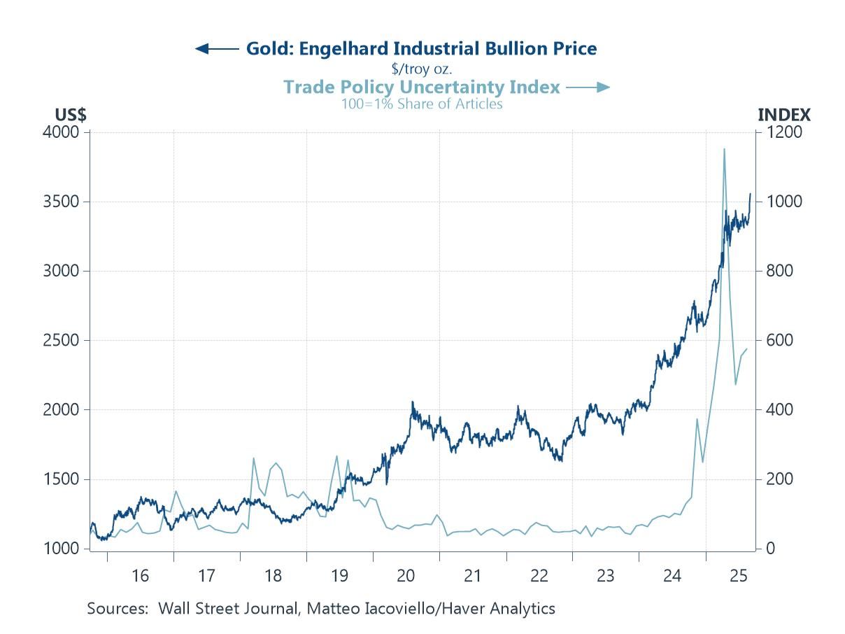
Charts of the Week: A Few Cuts More
Equity markets have lost a little ground in recent days and bond markets have been more jittery, as legal challenges to US tariff policies add to a tense backdrop of geopolitical meetings between China, Russia, and India. Gold’s surge to record highs arguably captures the search for safe havens amid this uncertainty (chart 1), while the possibility of tariff reversals keeps alive the prospect of relief for the most affected exporters, notably China, Japan, and South Korea (chart 2). India’s position looks more precarious, with its reliance on the US market colliding with a weakening trade-weighted currency as tariffs bite into growth and investor confidence (chart 3). Monetary policy expectations, however, continue to offer some support, with the latest Blue Chip Financial Forecasts survey pointing to sizeable easing in the US and UK (chart 4). The ECB is expected to tread more cautiously after earlier cuts and with headline inflation now near target. Still, if inflation continues to ease, further action remains possible (chart 5). In the US, corporate resilience is also helping offset some of the gloom: despite tariff-driven spikes in non-labour costs, falling unit labour costs—possibly aided by AI productivity gains—and firmer prices allowed profits per unit of output to rise in Q2 (chart 6).
by:Andrew Cates
|in:Economy in Brief
 Global| Aug 28 2025
Charts of the Week: Riskbusters
Global markets have continued to rally into late summer, buoyed by AI optimism, dovish signals from central bankers at Jackson Hole, and expectations of easier policy ahead. Yet beneath the surface, risks to the world economy are accumulating. In the US, labour market indicators point to softening conditions (chart 1), while tariff-driven pressures are beginning to push goods prices higher (chart 2). Global trade flows are being reshaped by US policy, with China’s excess capacity increasingly diverted toward Europe, most visibly through surging exports of electric vehicles (EVs) (charts 3 and 4). At the same time, wage growth remains stubbornly elevated in the UK, complicating disinflation (chart 5), while concerns are mounting over the country’s external vulnerabilities as net FDI and portfolio positions weaken against the backdrop of jittery debt markets (chart 6). Together, these dynamics highlight the tension between buoyant market performance and a global economy still grappling with structural fragilities.
by:Andrew Cates
|in:Economy in Brief
 Global| Aug 21 2025
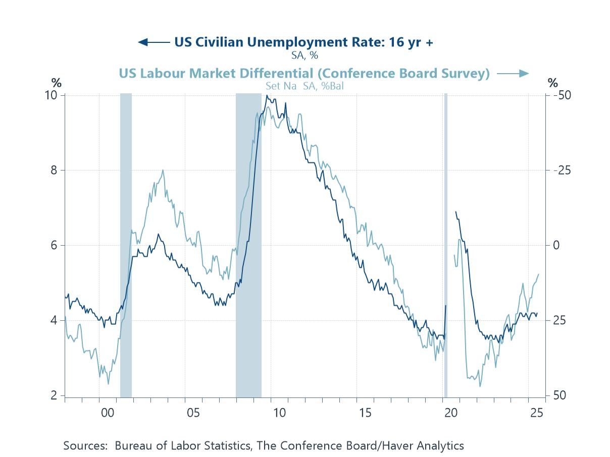
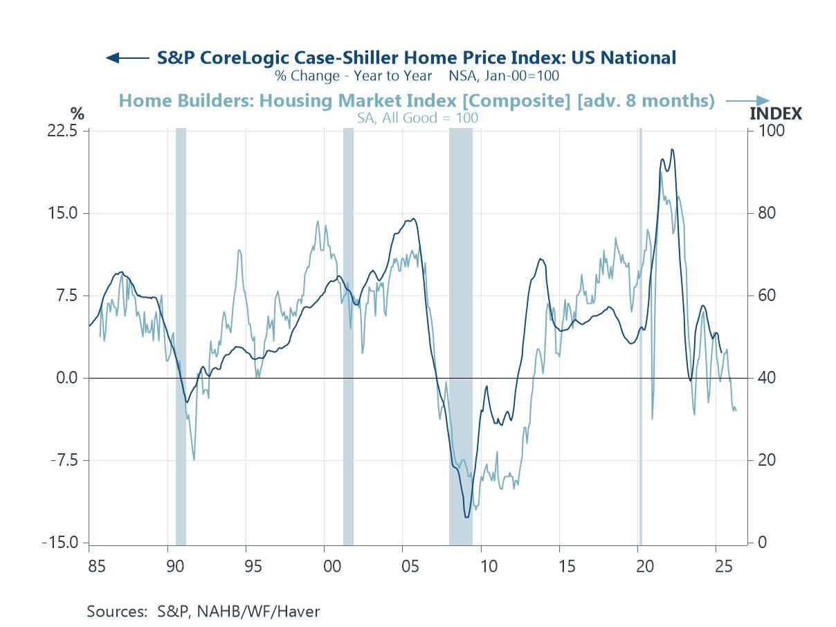
Charts of the Week: Cracks Beneath The Shine
Recent financial market gains have been underpinned by resilient global data, AI-fuelled optimism, and hopes that most central banks will continue to loosen monetary policy. Yet beneath the surface, a more complicated picture may be emerging. In the US, housing indicators are flashing warnings about household balance sheets and credit channels (chart 1), while China’s latest data—covering retail sales, industrial output, and property—underscore persistent weakness (chart 2). In the UK, this week’s data showing sticky services inflation is complicating the Bank of England’s easing path (chat 3), while back in the US, medium-term inflation expectations have been rising despite softer oil prices (chart 4), hinting at a more disruptive role for trade policy. Against this cyclical backdrop sit deeper structural challenges: global energy consumption remains overwhelmingly dependent on fossil fuels, the clean energy sector has lost momentum amid high costs and policy uncertainty, and equity markets have punished renewables even as climate imperatives intensify (charts 5 and 6). Together, these dynamics suggest that while markets continue to trade on optimism, the mix of weak housing signals, patchy Chinese demand, sticky inflation, and an uneven energy transition potentially leaves the global outlook more fragile than headline performance implies.
by:Andrew Cates
|in:Economy in Brief
- Global| Aug 19 2025
Powering Prosperity: Why the UK Has Been Falling Behind
Energy is not just another input into an economy — it is the foundation on which productivity, competitiveness, and long-term growth rest. The capacity to generate abundant, reliable, and affordable electricity underpins industrial strength, attracts investment, and enables technological transformation. Where these conditions are met, economies flourish; where they are absent, the result is stagnation.
That is why the UK’s dismal record on per-capita GDP growth over the past five years — one of the weakest among advanced economies — cannot be understood without reference to its electricity system. High prices, declining per-capita generation, and an energy mix that has failed to replace retiring firm capacity with equally reliable low-carbon alternatives have eroded competitiveness. By contrast, the United States has combined low electricity prices with high and stable per-capita generation, giving it a structural advantage in attracting energy-intensive industries and supporting the AI- and manufacturing-led investment boom.
by:Andrew Cates
|in:Viewpoints
- of22Go to 4 page