Global| Apr 19 2012
U.S. Initial Unemployment Insurance Claims Stutter
by:Tom Moeller
|in:Economy in Brief
Summary
Improvement in the labor market has slowed. That's the message from the latest figures from the Bureau of Labor Statistics. Initial claims for unemployment insurance slipped just 2,000 to 386,000 from an upwardly revised 388,000 [...]
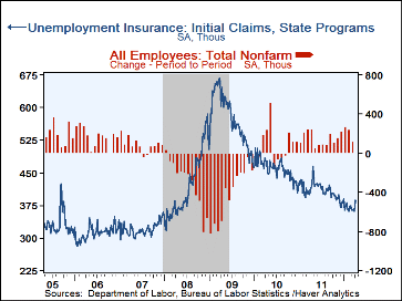 Improvement in the labor market has slowed.
That's the message from the latest figures from the Bureau of Labor
Statistics. Initial claims for unemployment
insurance slipped just 2,000 to 386,000 from an upwardly revised 388,000
during the prior week, earlier reported as 380,000. Earlier figures also
were revised. The latest number compared to Consensus expectations for 370,000
claims. The four-week moving average of initial claims rose to 374,750,
its highest since the end of January.
Improvement in the labor market has slowed.
That's the message from the latest figures from the Bureau of Labor
Statistics. Initial claims for unemployment
insurance slipped just 2,000 to 386,000 from an upwardly revised 388,000
during the prior week, earlier reported as 380,000. Earlier figures also
were revised. The latest number compared to Consensus expectations for 370,000
claims. The four-week moving average of initial claims rose to 374,750,
its highest since the end of January.
The latest initial claims figure covers the survey period for March payroll employment and it rose 22,000 (6.0%) from the February period. During the last ten years there has been a 74% correlation between the level of claims and the m/m change in nonfarm payrolls.
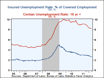
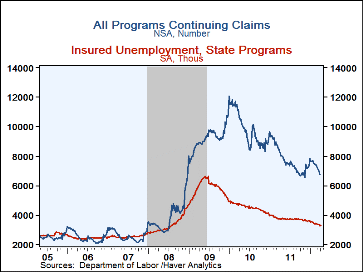
Continuing claims for unemployment insurance rose to 3.297M during the week of April 7. The insured rate of unemployment held at 2.6% for the fourth straight week, the lowest since August 2008. This particular count covers only "regular" programs and does not include all extended benefit and other specialized jobless insurance programs. In the week of March 31, the latest figure available, the grand total of all benefit recipients fell to 6.765M (-18.5% y/y).
By state, the insured unemployment rate varied greatly with Virginia (1.4%), Texas (1.6%), Florida (1.8%), Louisiana (1.8%), Arizona (2.1%), Tennessee (2.0%), and Indiana (2.1%) at the low end of the range. At the high end were rates in New York (3.2%), Massachusetts (3.4%), Michigan (3.4%), Connecticut (3.6%), California (3.8% ), New Jersey (3.8%), and Pennsylvania (3.8%).
Data on weekly unemployment insurance programs are contained in Haver's WEEKLY database, including the seasonal factor series, and they are summarized monthly in USECON. Data for individual states, including the unemployment rates that determine individual state eligibility for the extended benefits programs and specific "tiers" of the emergency program, are in REGIONW, a database of weekly data for states and various regional divisions. Action Economics consensus estimates are in AS1REPNA.
Who Is The Most Unemployed? Factors Affecting Joblessness from the Federal Reserve Bank of Atlanta is available here.
| Unemployment Insurance (000s) | 04/14/12 | 04/07/12 | 03/31/12 | Y/Y% | 2011 | 2010 | 2009 |
|---|---|---|---|---|---|---|---|
| Initial Claims | 386 | 388 | 362 | -6.8 | 409 | 459 | 574 |
| Continuing Claims | -- | 3,297 | 3,271 | -11.8 | 3,745 | 4,544 | 5,807 |
| Insured Unemployment Rate (%) | -- | 2.6 | 2.6 | 3.0(4/11) | 3.0 | 3.6 | 4.4 |
| Total "All Programs" (NSA) | -- | -- | 6.765M | -18.5 | 7.750M | 9.850M | 9.163M |
By Tom Moeller
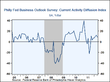
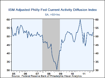
The Philadelphia Federal Reserve Bank's General Business Conditions Index slipped last month to 8.5 from 12.5 in March. Nevertheless, positive numbers for the last seven months indicate expansion in activity. The latest reading was lower than Consensus expectations for 12.0. Haver Analytics constructs an ISM-adjusted reading of the Philadelphia number. This figure rose to 52.4 this month, its highest level since November. During the last ten years there's been a 73.0% correlation between the level of the Philadelphia Fed Business Conditions Index and the three-month growth in factory sector industrial production. There's also been a 76% correlation with q/q growth in real GDP.
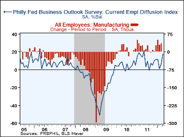
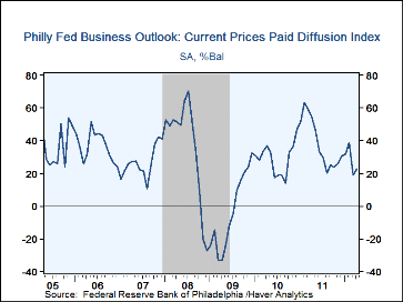
Monthly changes were varied amongst the component series. To the downside were the figures for new orders, shipments and the length of the workweek. Improving were the readings for unfilled orders, inventories, delivery times and employment. During the last ten years there has been an 86% correlation between the employment figure and the m/m change in factory sector payrolls. Also improving slightly was the reading of prices paid. Twenty-seven percent of firms paid higher prices while five percent paid less. During the last ten years there has been a 70% correlation between the prices paid index and the three-month growth in the intermediate goods PPI.
The separate index of expected business conditions in six months improved slightly. That made up a March decline but the figure remained well below its January high.
The survey panel consists of 150 manufacturing companies in Federal Reserve District III (consisting of southeastern PA, southern NJ and Delaware.) The diffusion indexes represent the percentage of respondents indicating an increase minus the percentage indicating a decrease in activity. The figures from the Philadelphia Federal Reserve can be found in Haver's SURVEYS database. The Consensus expectations figure is available in AS1REPNA.
| Philadelphia Fed (%) | Apr | Mar | Feb | Apr'10 | 2011 | 2010 | 2009 |
|---|---|---|---|---|---|---|---|
| ISM-Adjusted General Business Conditions | 52.4 | 50.3 | 51.2 | 55.6 | 51.9 | 50.7 | 41.2 |
| General Business Conditions | 8.5 | 12.5 | 10.2 | 15.1 | 7.7 | 12.1 | -7.6 |
| New Orders | 2.7 | 3.3 | 11.7 | 15.3 | 7.1 | 5.5 | -9.5 |
| Shipments | 2.8 | 3.5 | 15.0 | 25.2 | 9.9 | 8.3 | -7.9 |
| Unfilled Orders | 3.2 | -11.0 | 2.2 | 10.2 | -0.9 | -3.0 | -15.2 |
| Delivery Time | -3.4 | -7.1 | 1.5 | 7.4 | -0.4 | 0.9 | -15.2 |
| Inventories | 8.2 | 0.9 | -12.9 | 1.5 | -0.4 | -5.0 | -24.0 |
| Number of Employees | 17.9 | 6.8 | 1.1 | 14.0 | 11.0 | 4.6 | -23.8 |
| Prices Paid | 22.5 | 18.7 | 38.7 | 54.4 | 38.6 | 28.8 | -3.6 |
By Tom Moeller
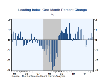
The Leading Economic Indicator index from the Conference Board rose 0.3% last month after an unrevised 0.7% gain during February. A 0.2% increase had been expected. Last month a robust 70% of the series' components rose. That compares favorably to last September's low of 25%. A steeper interest rate yield curve, more building permits and higher stock prices had the largest effects raising the overall leading index. The separate Leading Credit Index slipped for the third straight month and indicated tighter conditions versus the easy state of last summer and fall.
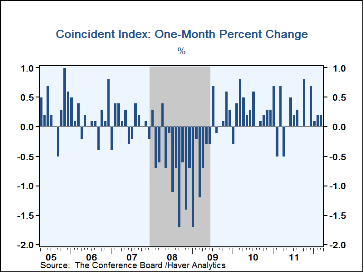
The index of coincident indicators again rose 0.2%. Higher manufacturing & trade sales, increased payroll employment and improved personal income made positive contributions to the index change last month. Industrial production was unchanged for the second consecutive month.
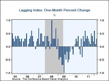
The index of lagging indicators, designed to measure economic slack, rose 0.3% after a 0.1% February uptick.
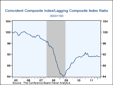
Another leading economic series is the ratio of coincident-to-lagging indicators. It measures how the economy is performing versus its excesses and was unchanged during the past year.
The Conference Board figures are available in Haver's BCI database; the components are available there, and most are also in USECON. The forecast figure for the Consensus are in the AS1REPNA database. Visit the Conference Board's site for coverage of leading indicator series from around the world.
| Business Cycle Indicators (%) | Mar | Feb | Jan | Y/Y | 2011 | 2010 | 2009 |
|---|---|---|---|---|---|---|---|
| Leading | 0.3 | 0.7 | 0.2 | 2.1 | 5.1 | 7.6 | -12.8 |
| Coincident | 0.2 | 0.2 | 0.1 | 2.5 | 2.8 | 2.5 | -7.7 |
| Lagging | 0.3 | 0.1 | 0.5 | 3.8 | 1.8 | -2.9 | -1.0 |
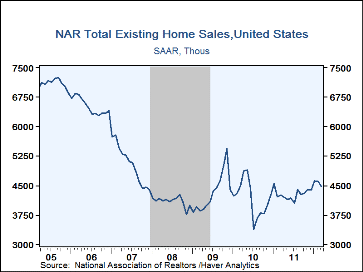
Sales of existing homes fell 2.6% last month to a 4.480 annual rate (+5.2% y/y) from a revised 4.600M during February, last month reported as 4.590M. Despite the decline, sales remained near the highest since May 2010. Sales of existing single-family homes alone fell 2.5% last month to 3.970M, up 5.9% y/y. (These data have a longer history than the total sales series). Sales of condos and co-ops declined 3.8% m/m to 0.510M and were unchanged y/y.
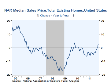
The median price of an existing home rose 5.3% (2.5% y/y) to $163,800. In the Northeast, the median sales price of $228,300 was down 1.9% y/y. In the West, the median price rose 2.5% y/y to $198,300. In the South, the price of $146,500 was up 6.2% y/y and in the Midwest the price of $132,800 rose 5.2% y/y.
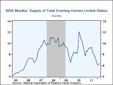
The months' supply of homes on the market was stable at 6.3 and that was near the lowest since March, 2006. The months' supply of single-family homes on the market ticked up to 6.3 and for condos & coops it slipped to 7.1. The total number of homes on the market fell m/m and was down 21.8% y/y to the lowest since 2005. Inventories of single-family homes fell 20.1% y/y while inventories of multi-family homes were off nearly one-third.
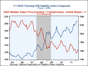
Reported earlier this month, the composite index of home price affordability rose 8.9% y/y in February to another record high as mortgage payments as a percent of income held at 12.1% versus the high of roughly 25% in 2006. The average monthly mortgage rate slipped to 4.21%.
The data on existing home sales, prices and affordability can be found in Haver's USECON database. The regional price, affordability and inventory data are available in the REALTOR database. The expectations figure is in the AS1REPNA database.
| Existing Home Sales (Thous, SAAR) | Mar | Feb | Jan | Y/Y% | 2011 | 2010 | 2009 |
|---|---|---|---|---|---|---|---|
| Total | 4,480 | 4,600 | 4,630 | 5.2 | 4,283 | 4,181 | 4,329 |
| Northeast | 580 | 590 | 600 | 5.5 | 544 | 563 | 580 |
| Midwest | 1,020 | 1,020 | 1,010 | 15.9 | 920 | 908 | 975 |
| South | 1,750 | 1,770 | 1,760 | 3.6 | 1,685 | 1,626 | 1,640 |
| West | 1,130 | 1,220 | 1,260 | -0.9 | 1,133 | 1,083 | 1,134 |
| Single-Family Sales | -- | 4,060 | 4,100 | 9.4 | 3,797 | 3,704 | 3,868 |
| Median Price, Total, ($, NSA) | -- | 156,600 | 154,600 | 0.3 | 164,542 | 172,442 | 172,783 |
By Robert Brusca
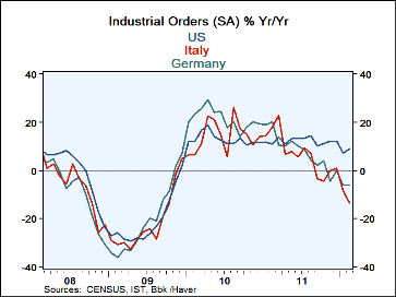 As different as we think that Germany and Italy are their industrial orders have been behaving remarkably similarly.
The correlation between German and Italian orders over the past nine years is 0.91 on Y/Y percentage changes (or
if you prefer, R-square value of 0.84). Clearly these two euro-members are facing many of the same conditions in
their respective export markets. And despite the fact that Italy has a much higher price level and seems to have
a price disadvantage Vs Germany this does not seem to be showing up in export order differences.
As different as we think that Germany and Italy are their industrial orders have been behaving remarkably similarly.
The correlation between German and Italian orders over the past nine years is 0.91 on Y/Y percentage changes (or
if you prefer, R-square value of 0.84). Clearly these two euro-members are facing many of the same conditions in
their respective export markets. And despite the fact that Italy has a much higher price level and seems to have
a price disadvantage Vs Germany this does not seem to be showing up in export order differences.
The Impure-o-Zone:This points out one more odd aspect of the Euro Area, or let me call it by a new name: the impure-o-Zone. Even within Italy there are regions that are much more productive than others. Italy’s manufacturing center is in the North. It is where Italy is the most competitive. From this base Italy is able to maintain its competitive edge Vs Germany. But viewing Italy’s competitiveness as based on a price level as reported for the nation as a whole makes Italy seem to have a price disadvantage. But the whole of Italy does not manufacture and export. The North does. This is no different than the finding that Germany is much more competitive than EMU as a whole. When Germany exports it does so from the much lower price metrics of Germany alone not based on the averages for the Zone.
A country is not simply an economic unit (eunuch?)- What is different is that Italy is a single economic unit with political cohesion (cohesion Italian-style, of course). Its regional inflation and price differences and competitiveness differences are woven into its socio-economic fabric. The same sorts of divisions within the Zone itself have a different impact because there is no political union and because in the case of Italy, differences arose out of years (centuries?) of custom and practice but in the Zone they have arisen out of a few years of being locked in a currency zone without any mechanism to homogenize competitive forces.
Indeed even for Italy the regional differences continue to nag at its political make-up. Italy has long been torn by North-South differences but in the end Italy is still one country. So the difference between having a schism in competitiveness within a single political unit like Italy and having one in jury-rigged amalgam like the Euro Area is huge. As we can see, the lack of political mechanisms in EMU to smooth the impact of such regional differences in competiveness and the absence of any mechanism to distribute inflation evenly in the area has led to the formation of huge imbalances. In the end it is the undoing of the Zone.
| Italy Orders | ||||||||
|---|---|---|---|---|---|---|---|---|
| SAAR Except M/M | Feb'12 | Jan'12 | Dec'11 | 3Mo | 6Mo | 12Mo | Q-2-D | %Peak |
| Total | -2.5% | -7.7% | 5.3% | -19.5% | -27.2% | -13.4% | -24.5% | 75.4% |
| Foreign | 1.1% | -7.3% | 5.0% | -6.3% | -19.2% | -4.8% | -18.3% | 83.8% |
| Domestic | -4.9% | -7.8% | 5.4% | -27.2% | -31.9% | -18.4% | -28.2% | 69.9% |

Tom Moeller
AuthorMore in Author Profile »Prior to joining Haver Analytics in 2000, Mr. Moeller worked as the Economist at Chancellor Capital Management from 1985 to 1999. There, he developed comprehensive economic forecasts and interpreted economic data for equity and fixed income portfolio managers. Also at Chancellor, Mr. Moeller worked as an equity analyst and was responsible for researching and rating companies in the economically sensitive automobile and housing industries for investment in Chancellor’s equity portfolio. Prior to joining Chancellor, Mr. Moeller was an Economist at Citibank from 1979 to 1984. He also analyzed pricing behavior in the metals industry for the Council on Wage and Price Stability in Washington, D.C. In 1999, Mr. Moeller received the award for most accurate forecast from the Forecasters' Club of New York. From 1990 to 1992 he was President of the New York Association for Business Economists. Mr. Moeller earned an M.B.A. in Finance from Fordham University, where he graduated in 1987. He holds a Bachelor of Arts in Economics from George Washington University.
More Economy in Brief